After the drawing course it was time for our long-awaited foray into colour – more specifically colour theory (Fin: Värioppi). This was something most of us welcomed with open arms after months of monochromatic charcoal and graphite drawing. Our teacher on this course was the artist Kristiina Lempiäinen-Trzaska.
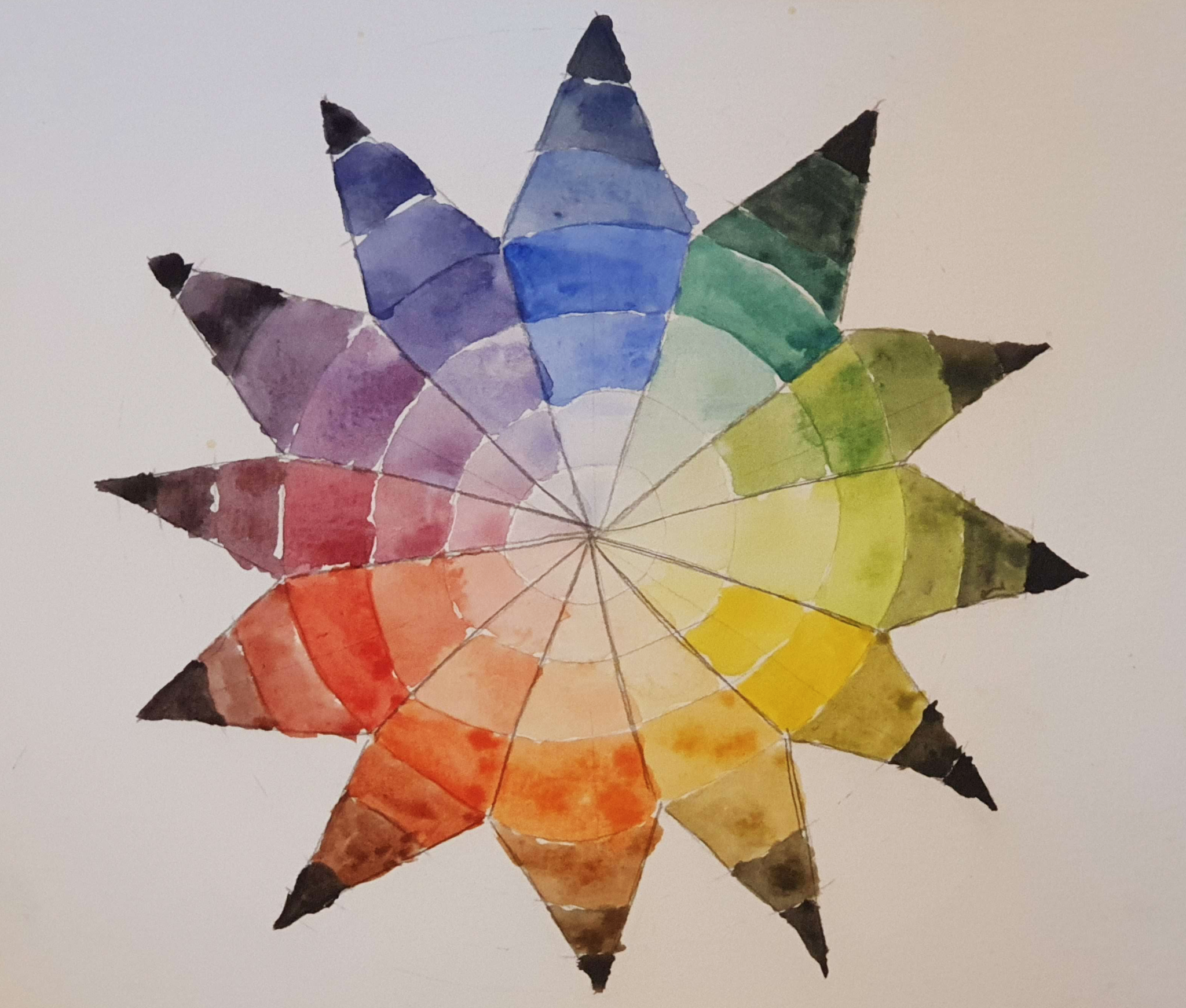
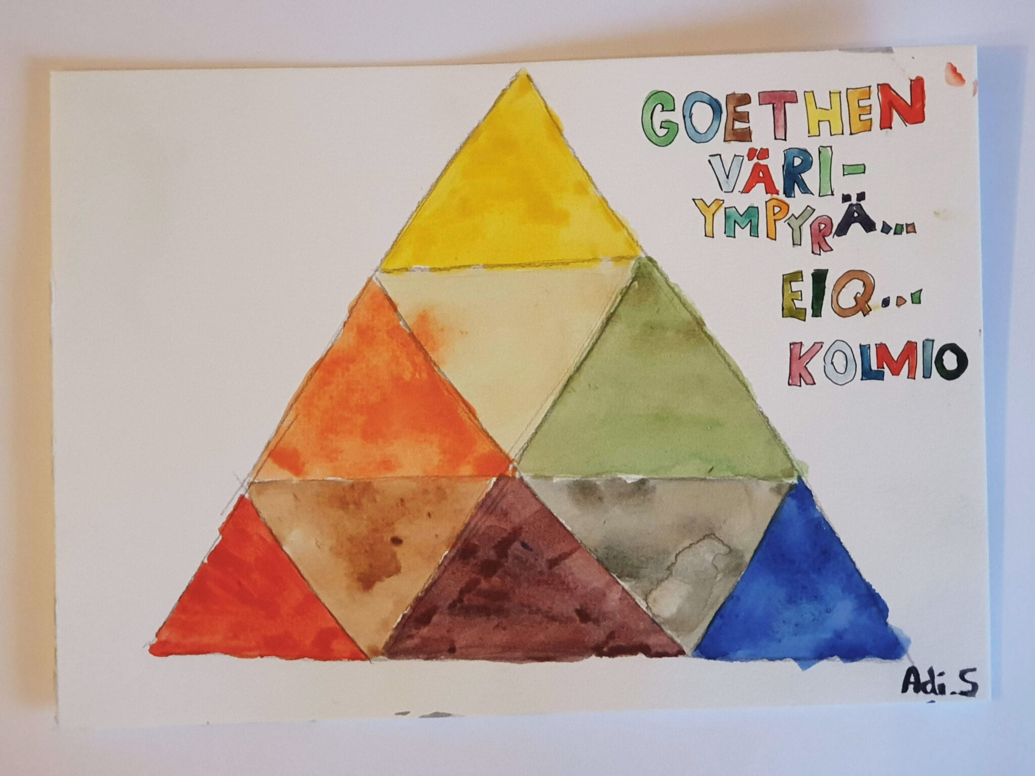
The course drew heavily on classical colour theory and different colour theorists. Goethe, Itten, Albers were all featured. We completed basic exercises in colour mixing and colour harmony, finished a good number of colour wheels of different sorts, an example of which is the Goethe’s colour star above.
Really, the course was a mix of practical colour theory and history of colour theory. A lot of people have had rather.. Peculiar ideas about colour, shall we say. All of Itten, Goethe, and Albers seemed to ascribe something mystical to colour, which I am not sure I fully agree with. To me a lot of it sounded like horoscopes for artists, and to this day it is not clear to me what the logic between Albers’ distinction of wet and dry colours is.
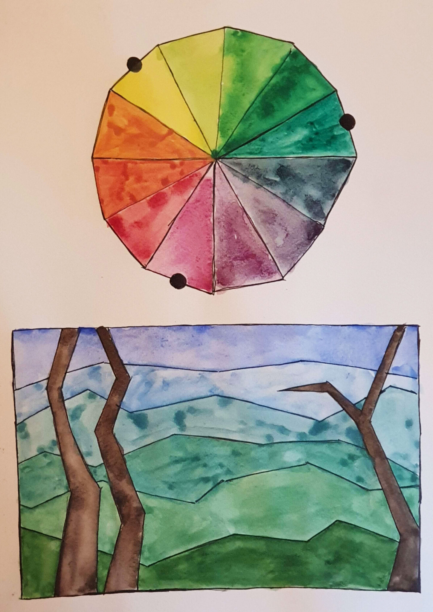
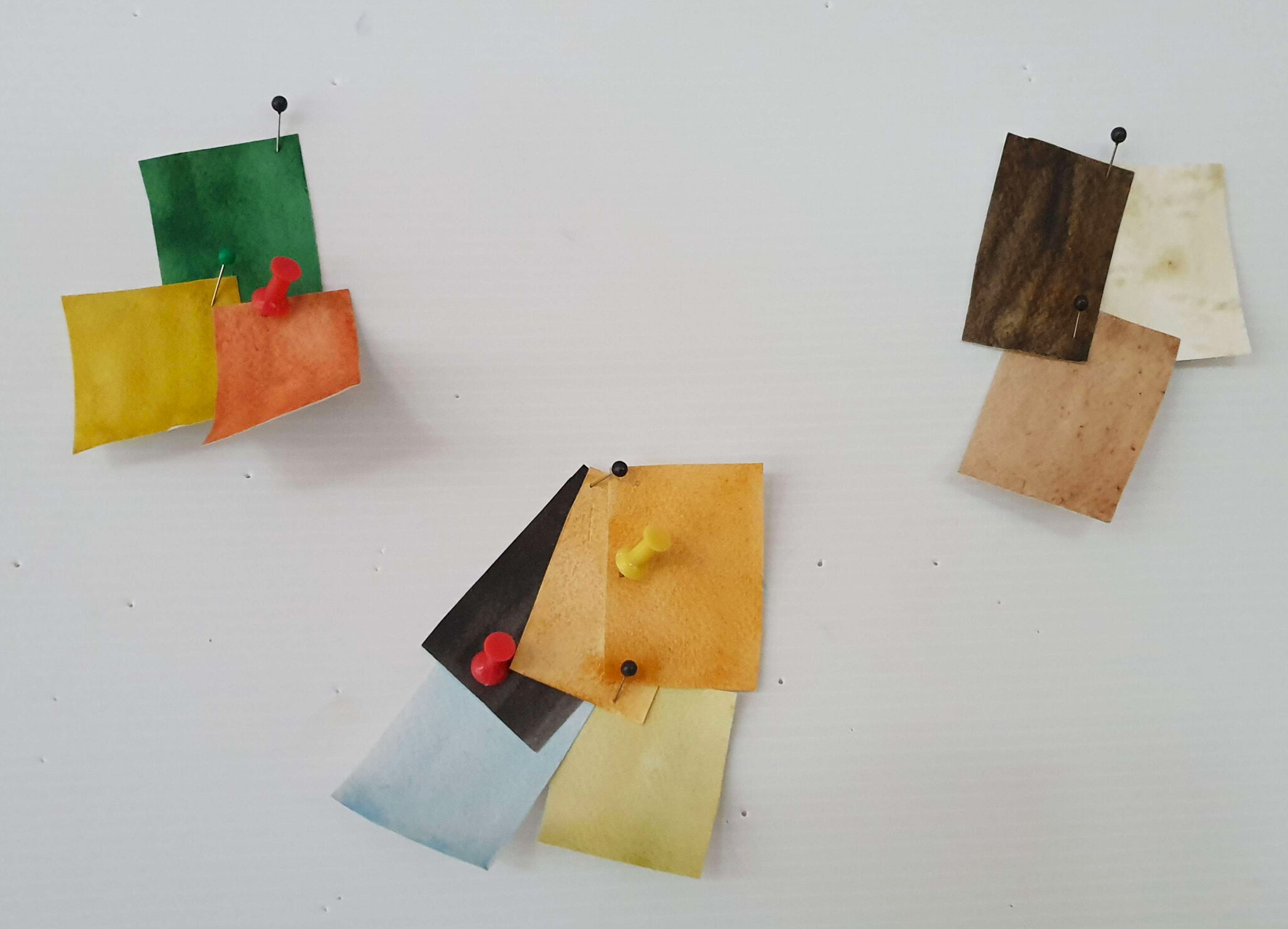
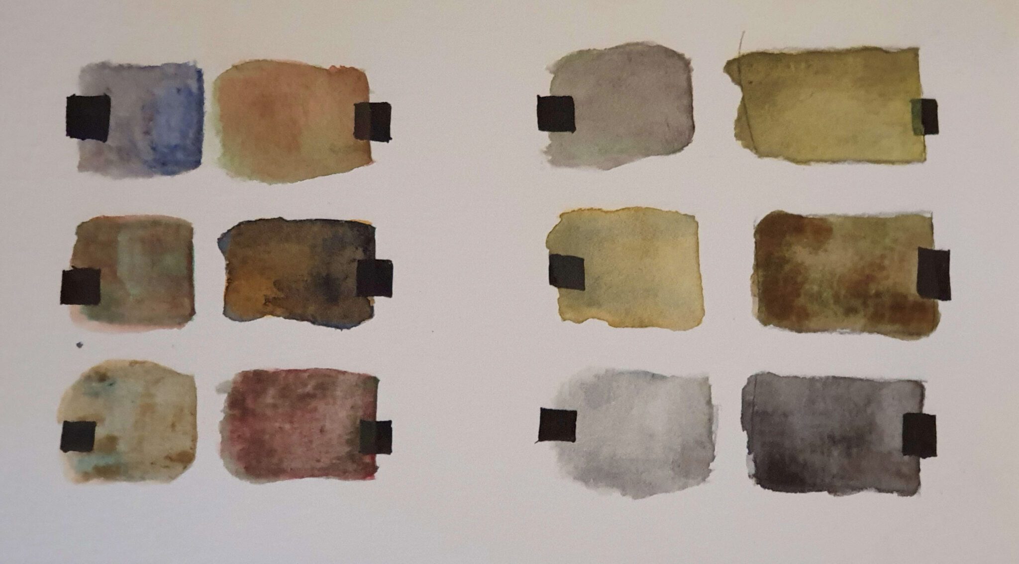
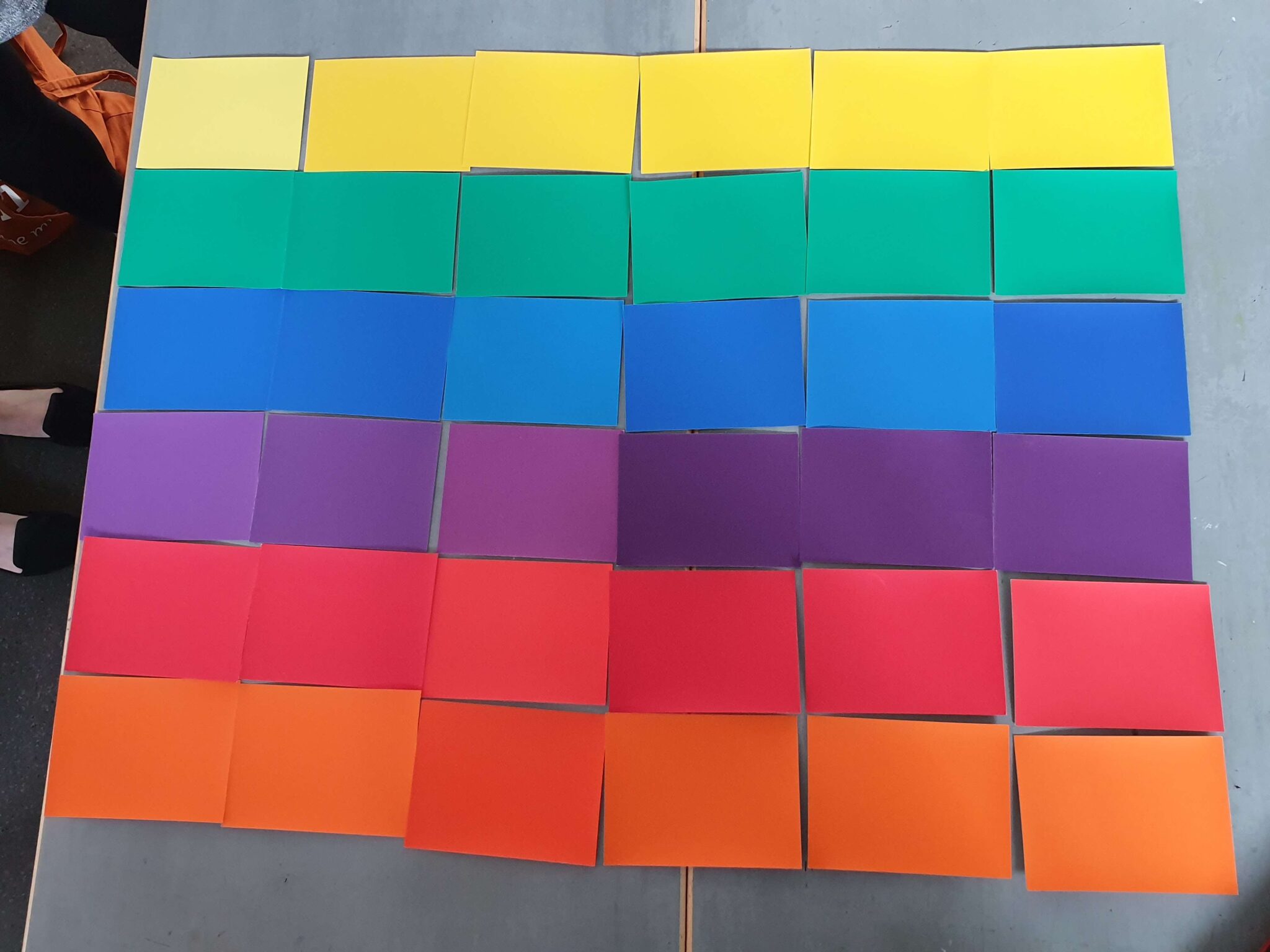
For the first half of the course we worked primarily in watercolour (or gouache), and focused on Goethe and Itten. The latter half focused on Josef Albers’ book Interaction of Colour (1963) – a classic of visual arts education. The exercises from the book were done using Color-Aid acid-free paper.
The book and our course focused heavily, as the name of the book might imply, on the interaction between colours. Dark colours make others near them appear lighter, strongly saturated greens make the surrounding colours appear more purple, etc. I highly recommend checking out the book from your local library (or from Amazon, if you’d prefer) if you want to know more about the specifics: Albers lists like twenty or so different forms of possible interactions, and these can combine in various ways.
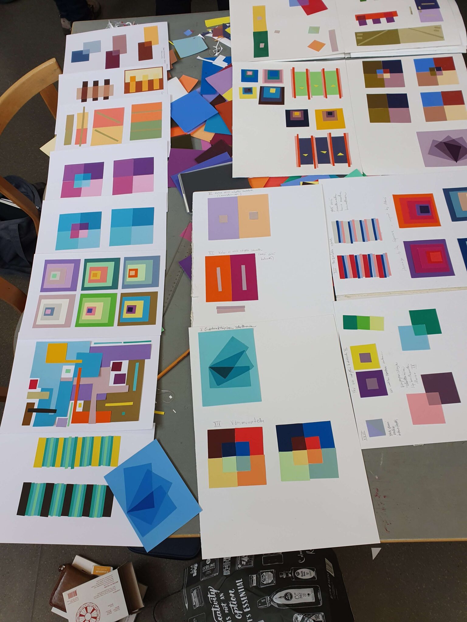
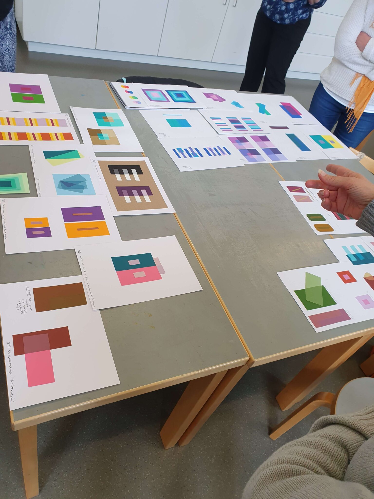
The modus operandi was gluing pieces of Color-Aid paper to get the desired effects and results. Albers does outline general suggested layouts, but the resulting effect is the important part and we were allowed to freestyle and experiment a fair bit. It was a great experience comparing results we got, and how much minutae differences in the surface area of a given colour can affect the illusion’s believability. Photographing these accurately is nigh-on impossible, or at least would take photography skills (and equipment?) much better than my own.
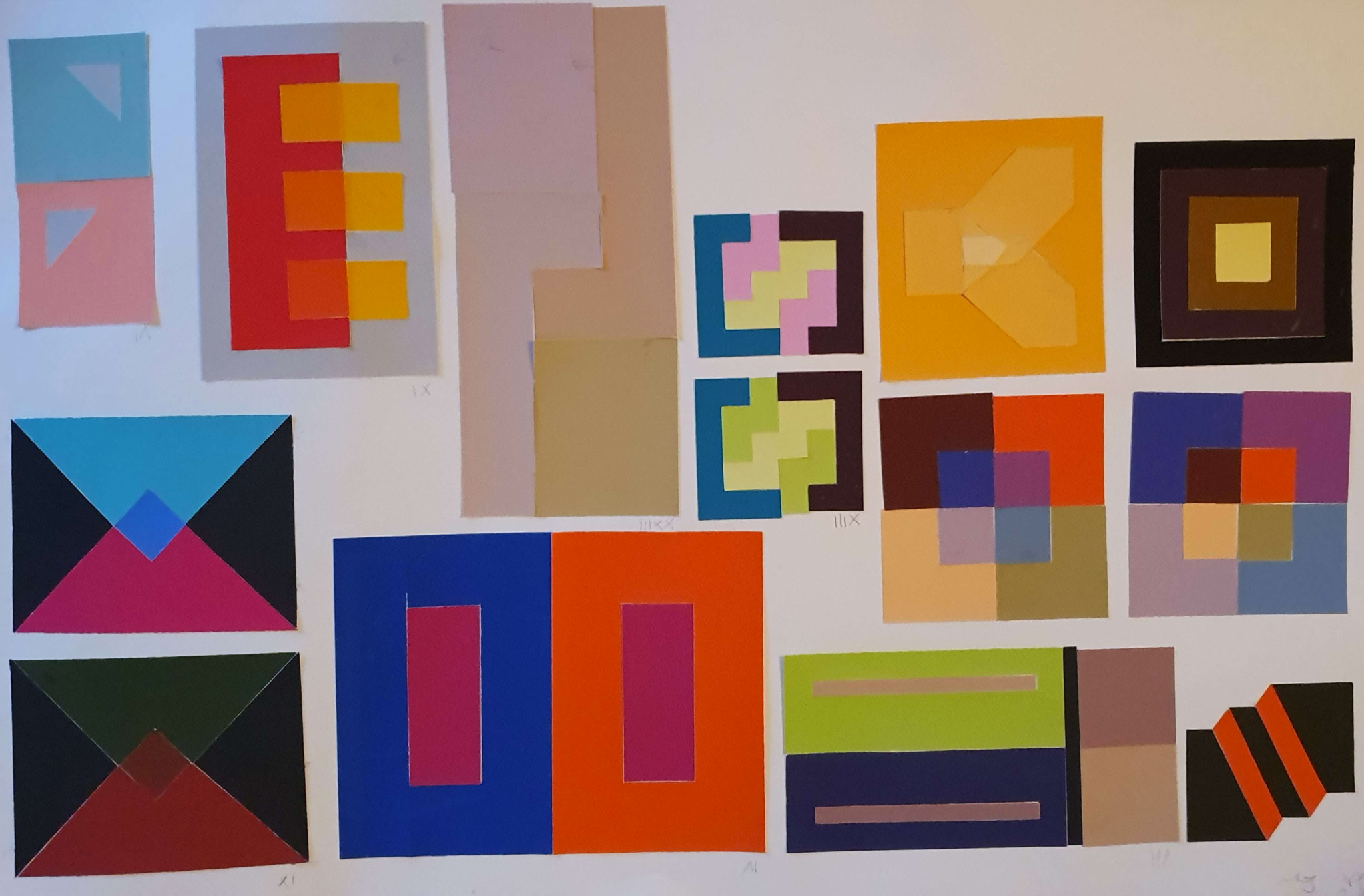
I learned a lot about colour during the course, and confirmed quite a bit that I had previously intuited. I also enjoyed hearing the history of colour theory. That being said, I am sure there ought to be a better method than precisely gluing flimsy pieces of paper on cardboard with perfect tolerances! Even a tiny gap between the papers would immediately compromise the whole effect, and you simply had to cut the papers with a craft knife to get the clean edge required. This took forever and at parts I felt like the main thing I was learning was how to glue paper properly.
I also wished that the course would’ve gone on to more modern colour theory: there have been plenty of advances, and things like process colour and how it affects printing is very interesting. Digitally colour is also handled very differently, as an additive rather than subtractive process, and many modern artists work digitally. Perhaps I’m just more scientifically-minded about the properties, rather than the at-times touchy-feely vibe that the earlier colour theorists seemed to follow. Still, as I said – I learned a lot. In that regard, the course was a great success.