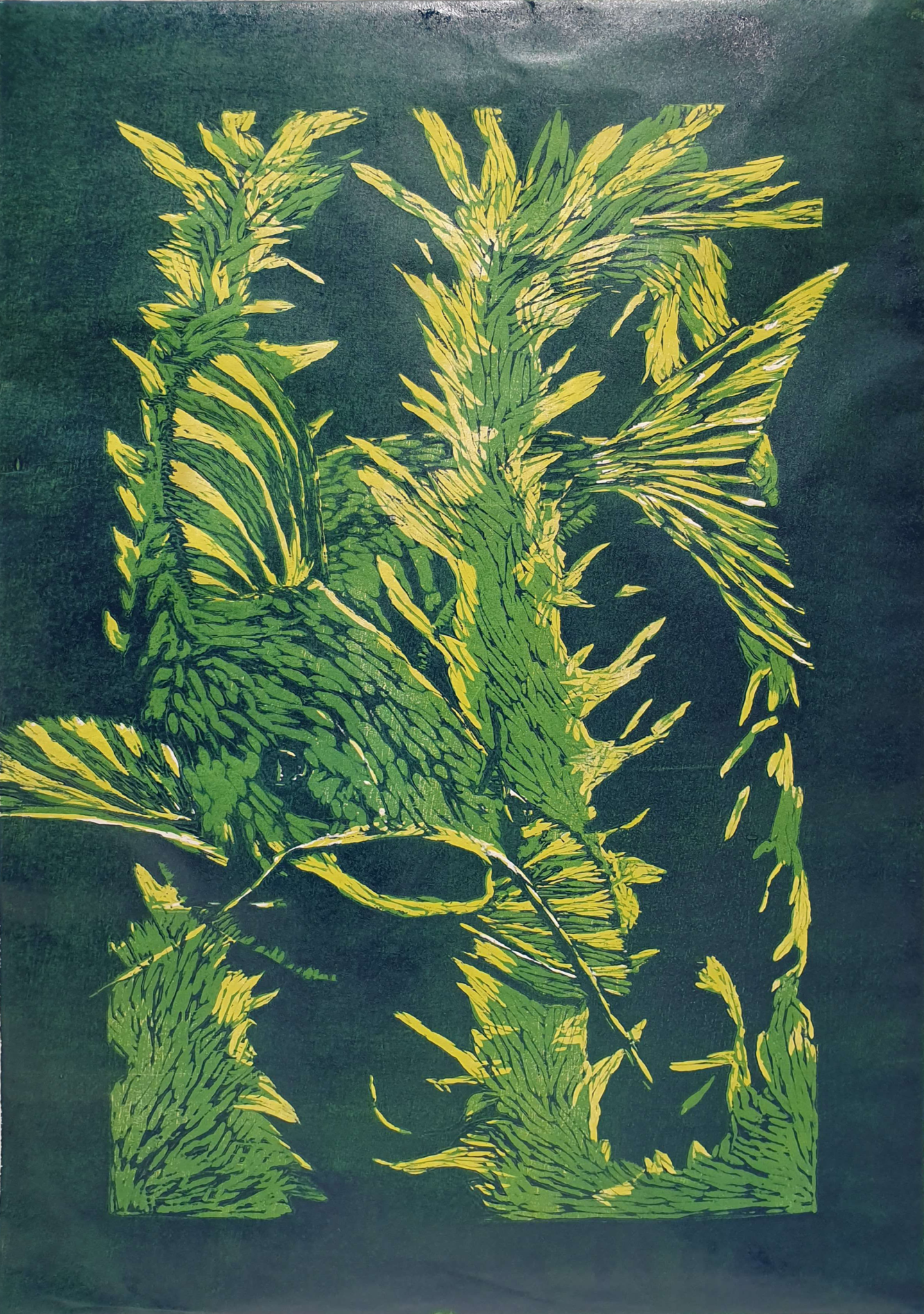
Our final course before portfolio was on printmaking! The teachers for this course were the artists and printmakers Maria Pihl (Carborundum and Woodcut) and Rita Vargas (Etching, Aquatint, Soft Ground), who introduced us to a plethora of printmaking techniques.
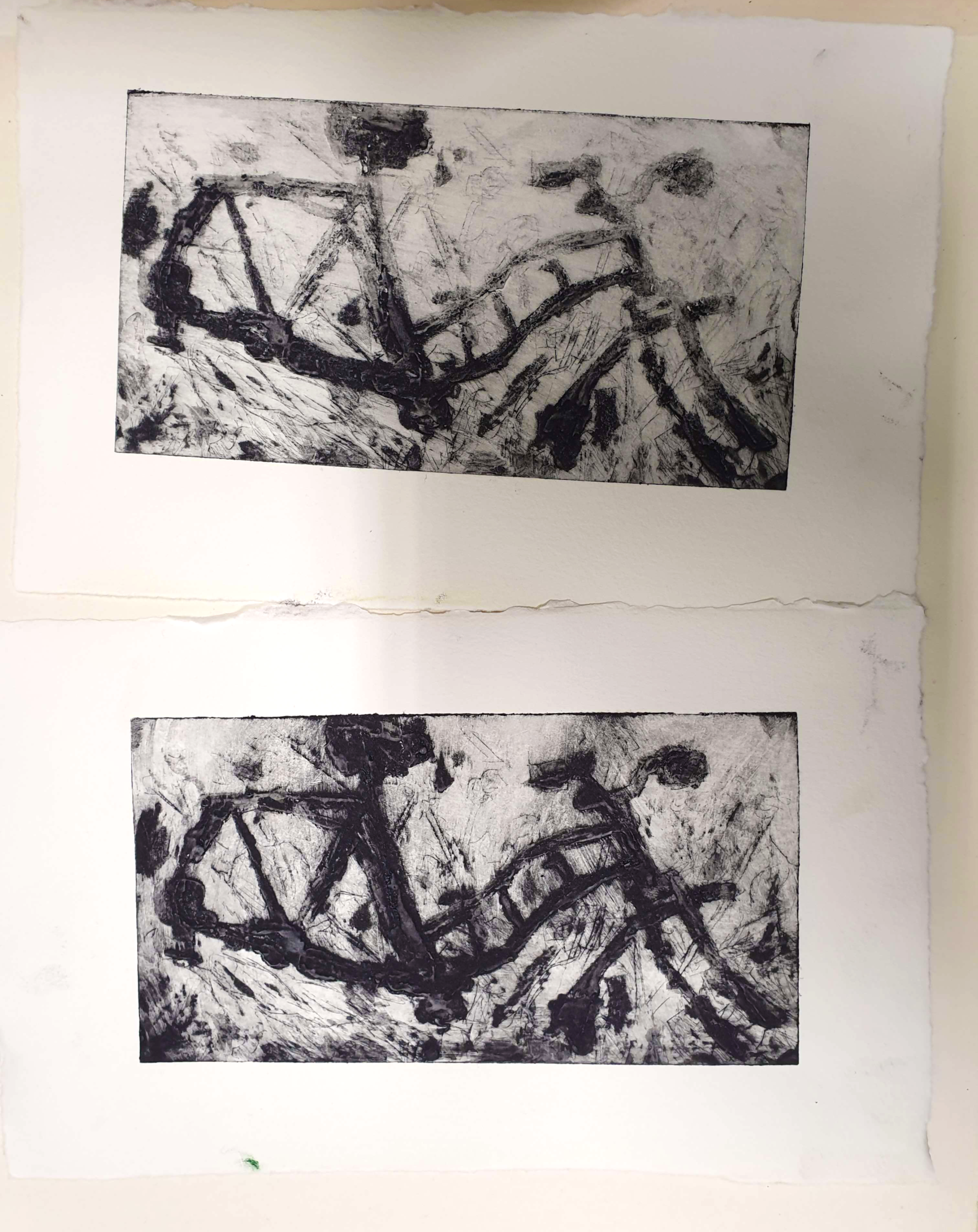
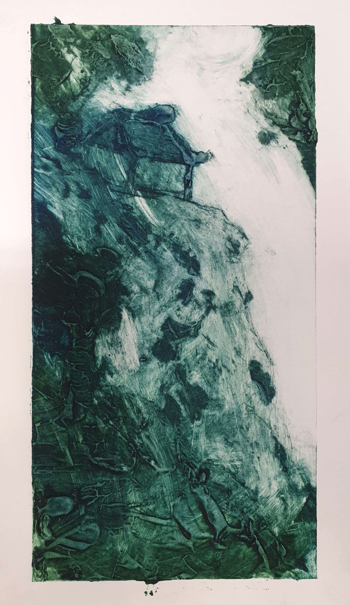
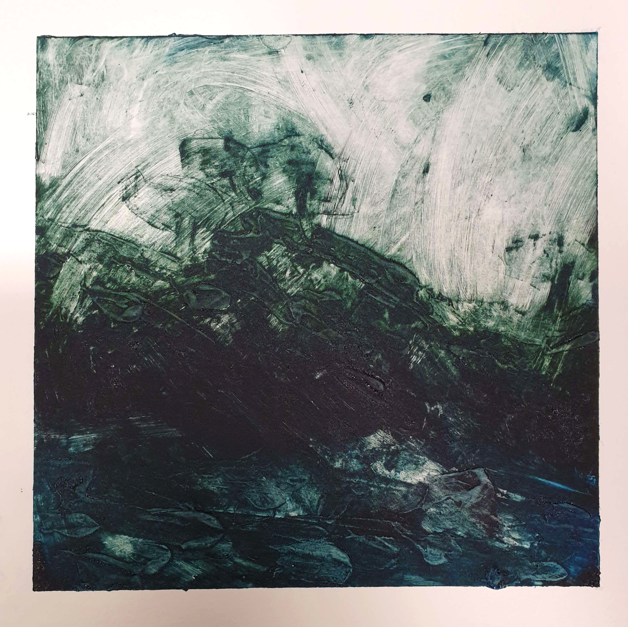
Our first technique was Carborundum Collagraph. In the technique you mix carborundum sand and acrylic gesso in various proportions and apply that on a metal plate – aluminum in our case. Depending on the mixture the section of the plate will then absorb different amounts of ink while inking, creating lighter and darker areas on the final print. It is an intaglio method, so combining it with drypoint – in which lines are scored to the plate with a sharp metal tool – was possible.
I am quite happy with the bicycle wrecks – I was able to take multiple prints of that one, and learn how much the amount of ink and rubbing affects the outcome. The cliffside abode was also rather successful. The less that can be said about the final, left-untitled landscape the better: A lot of the detail in it is unfortunately obscured by the dark tone of the ink.
Etching Etching and AquatintEtching and Aquatint (on the same plate)
Next it was time to play with acid! Well, not play – you actually ought to be careful around that stuff. Etching and aquatint work by applying some forms of resinous resist – “hard ground” – into copper plates and then selectively removing parts of it. The plate can then be submerged in acid for a time, and the acid dissolves the surface of the plate. The plates are then used for intaglio printing.
The etching alone got somewhat boring results, at least for me; I saw other students get much better and livelier ones. The process was also tedious for what amounted to something rather similar to drypoint printmaking. The aquatint, however, was much more fruitful! I am particularly proud of the broken and fairly painterly background I managed to create through progressive applications of stop-out and short acid baths for the plate. The very bottom is a bit too rough, but that was before I got the hang of the technique. I would like to experiment with aquatint techniques more in the future, as the results seem varied and expressive. The process is still a bit of a pain though.
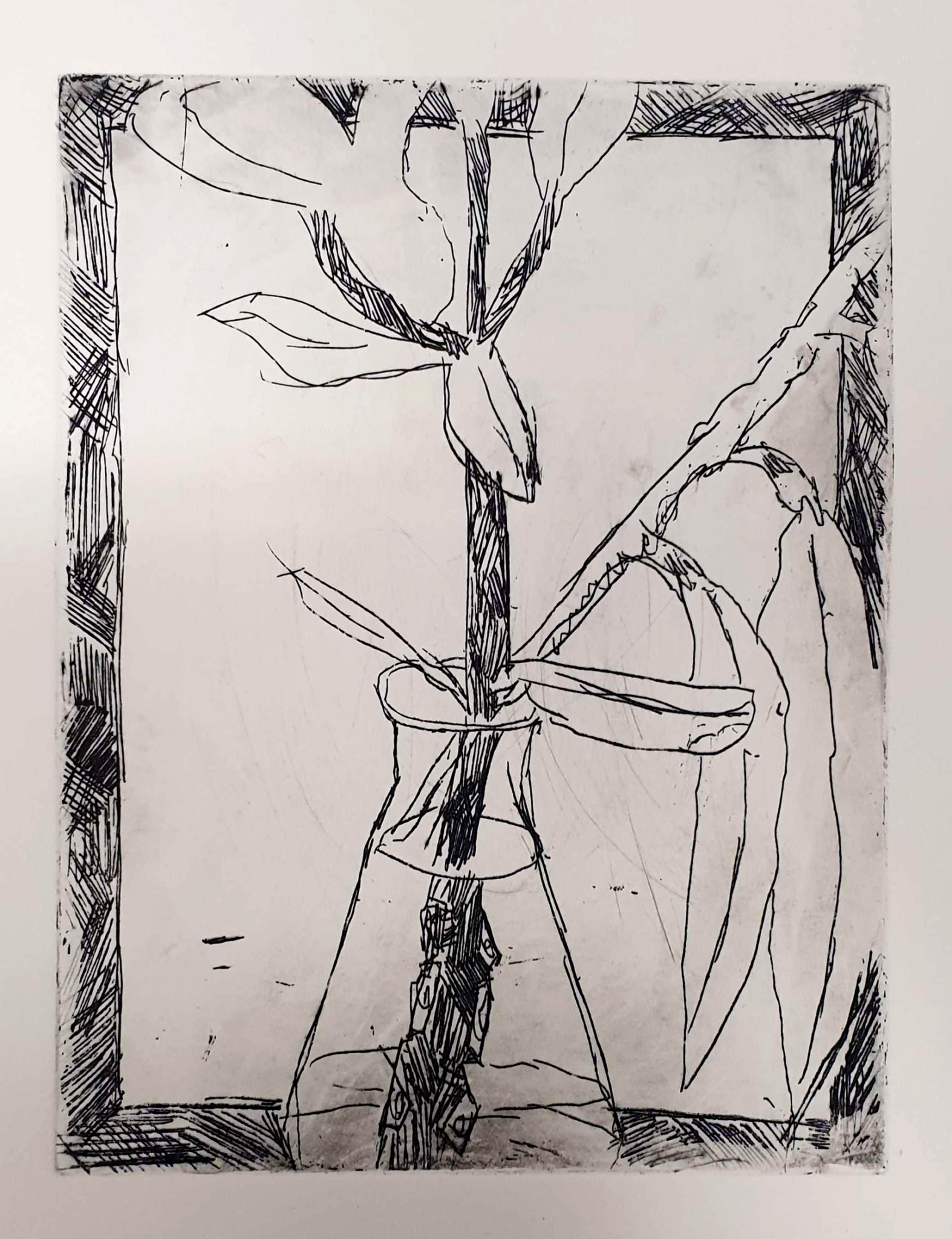
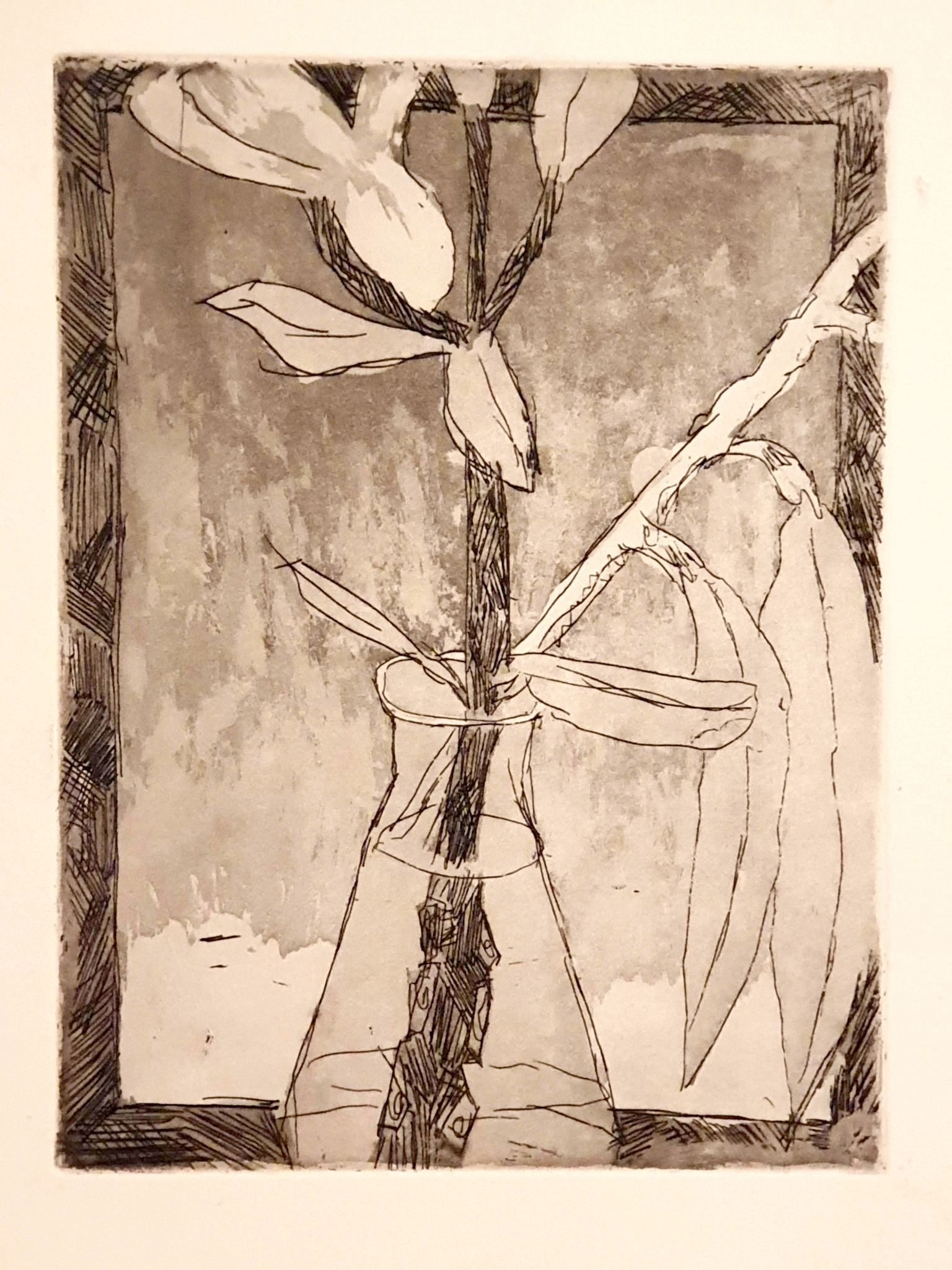
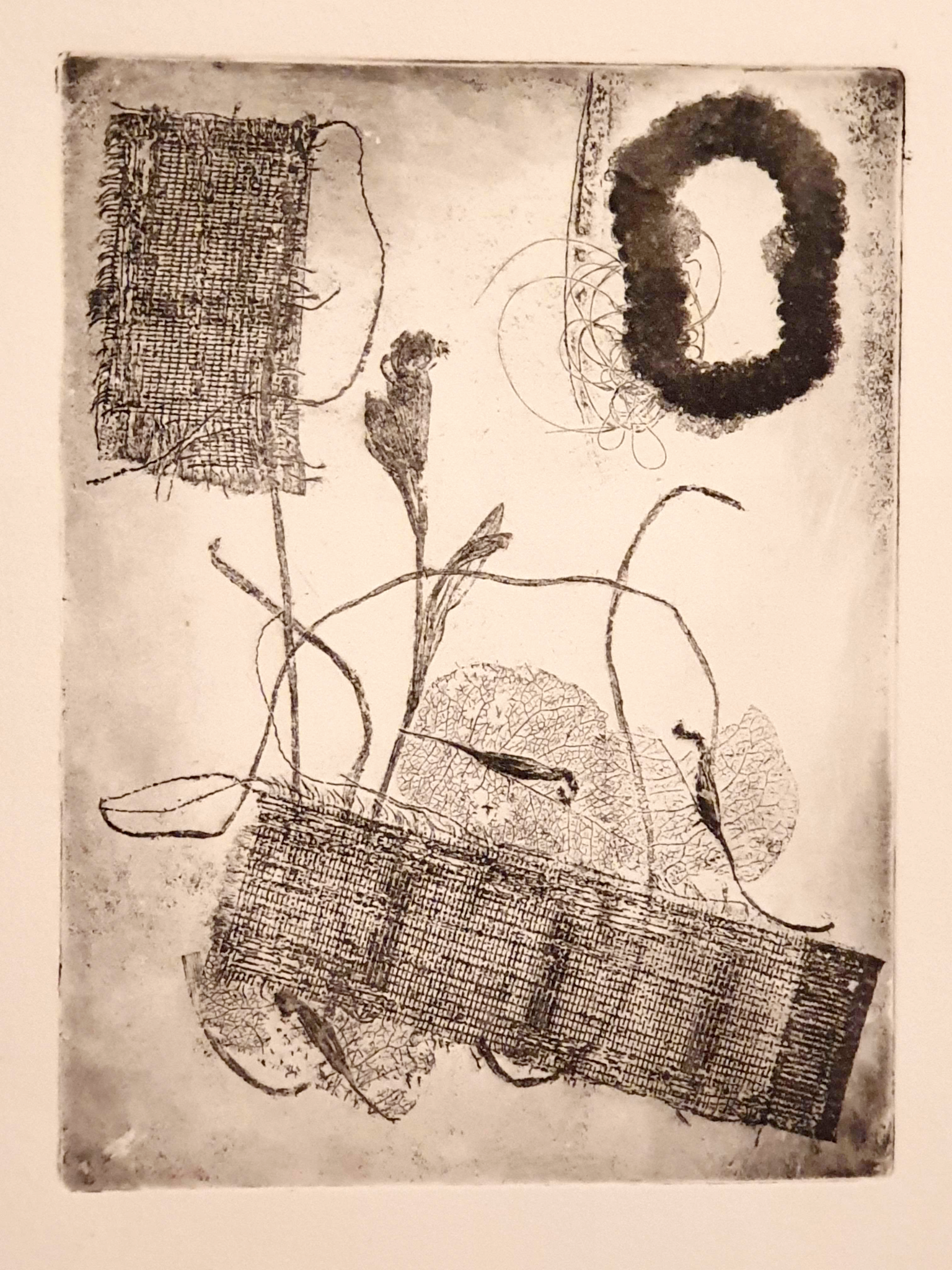
Soft Ground, using various objects (piece of canvas, dried plants, a hairtie with some hair)
After we had the hang of the acid-etching process we moved on to Soft Ground technique, which also utilizes it. The difference is that the resist applied is soft, rather than hard. The softness of the resist can then be utilized by pressing various thin and soft objects to it with the printing press, creating holes in the resist through which the acid can then act. The printing process itself is the same as for etching and aquatint.
The textures this technique creates are phenomenal: even though this was a rather quick experiment for us, I think the result is quite pleasing due to the variety created by the process. I have to admit that using various found objects in an abstract configuration like this makes me feel like I had limited creative input, and I don’t feel like I fully “own” the piece. Still, it was a great learning experience, and I would like to create something more intricate with the technique – perhaps trying to create something representative and only utilizing different objects for the textures. A portrait or a landscape, perhaps – I tend towards more representative work in general.
Vetten Valtias (“Ruler of the Waters”), oil print woodcut, 2022
Last but definitely not least we did woodcut oil printing. Unlike the other intaglio processes, woodcut is a form of relief printmaking – the raised surfaces left are going to hold the ink, instead of the recesses. I had previous experience in the technique due to attending a course by Maria Pihl before. Having previous experience allowed me to go for a multicolour plate reduction method – but I still went overtime in the class.
I love the results though. All that chiseling away at wood and applying ink on the plate really paid off. I love the colours created – they’re especially luminous in real life, as it’s printed with somewhat transparent ink on thin rice paper: the photo really doesn’t do it justice. The various textures created by woodcut printmaking are also really exquisite, and the directions of the cuts you make show up in the final product, emphasizing movement and form. Woodcut printmaking is definitely something I’ll keep on doing in the future, and not only because I’m attending one of Maria’s classes until the next summer. It is simply an enjoyable process that gets very beautiful results.
The course was overall pleasant but very busy: Time was definitely a limited resource. We only got introduced to these techniques and once we were done with one, it was time for another. A hectic experience, but very educational one. The classes were held at Ratamo – an old trainyard turned into a gallery and a printmaking/photography center – where it’s possible for artists and advanced hobbyists to use the printmaking facilities for a modest fee. If we want to continue exploring the techniques further, the resources to do so are available there.
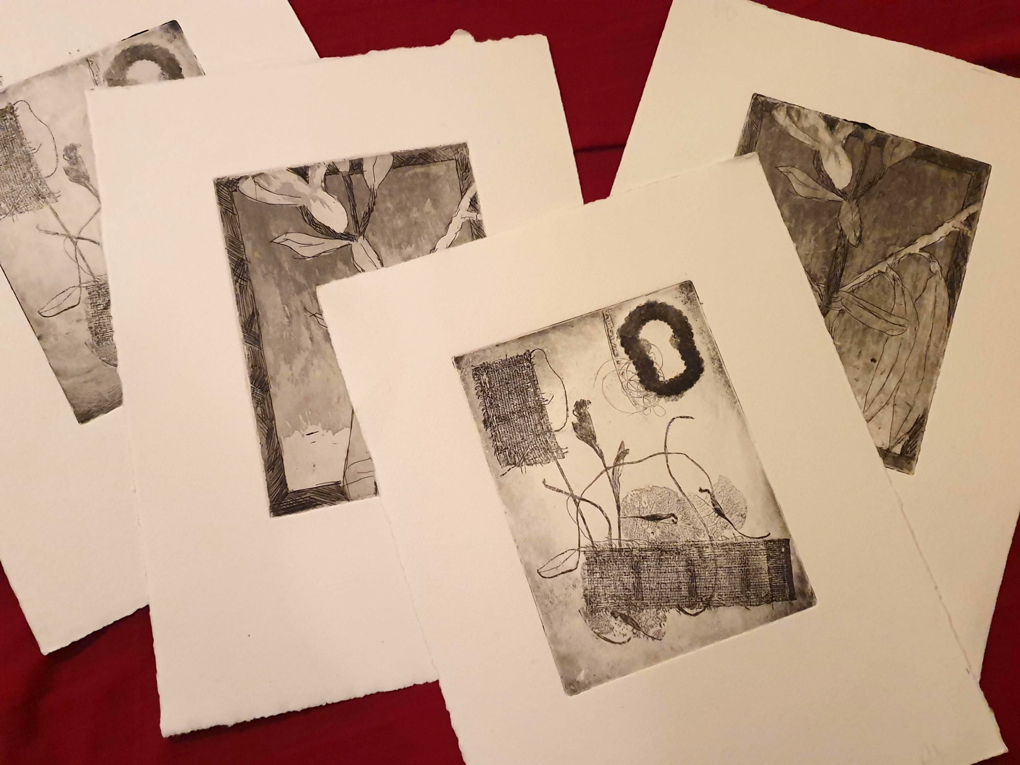
Collection of metal prints from the course. In intaglio printmaking, the thoroughness and care taken when applying the ink on the plate and rubbing really makes a tremendous difference.
Our next course was an escape from the realm of 2-dimensional surfaces. In plastic arrangement our teacher was the artist – and a delightfully friendly person – Kirsi Tapper. She was a great instructor, and we got to experiment with many different techniques.
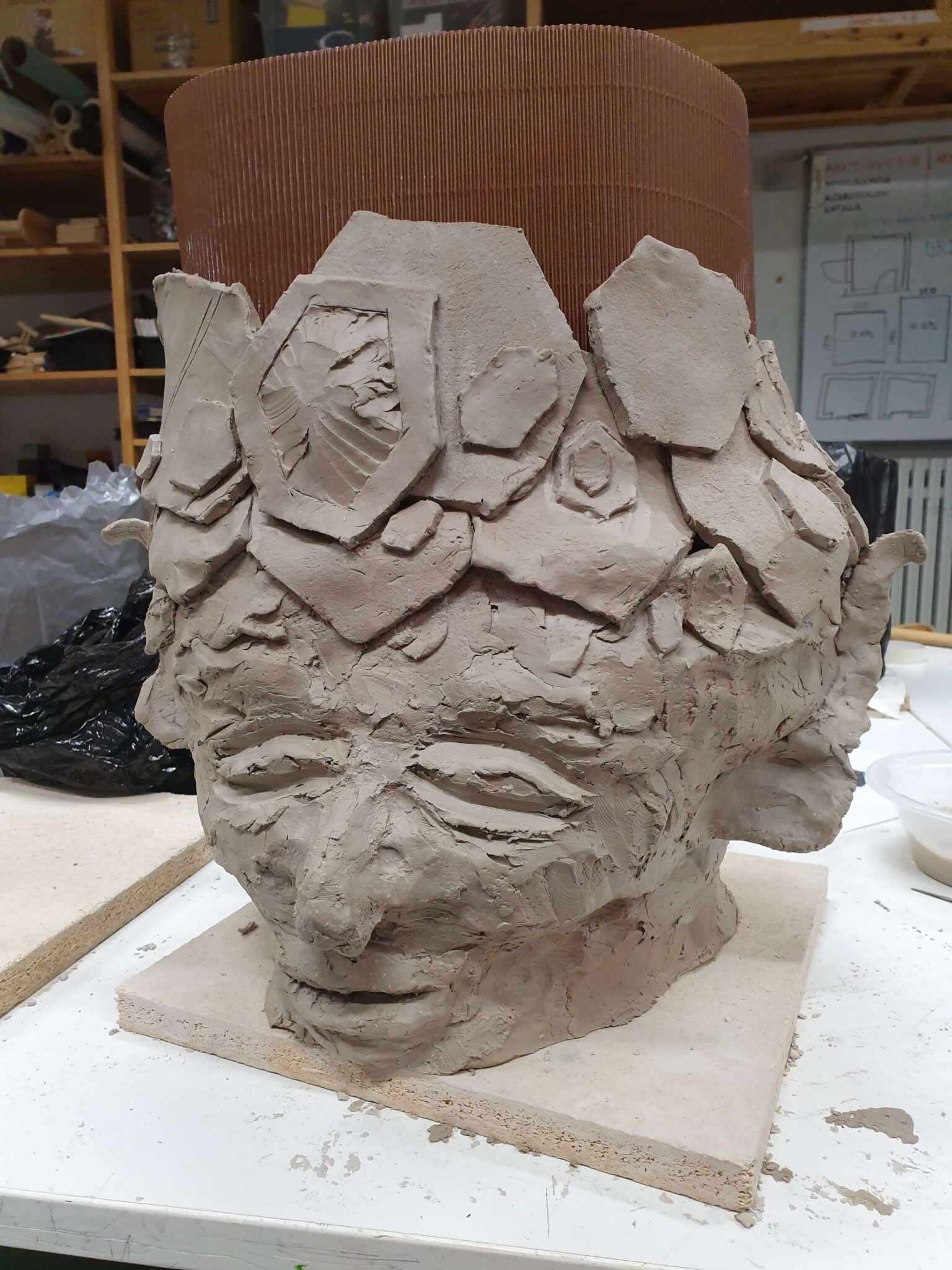
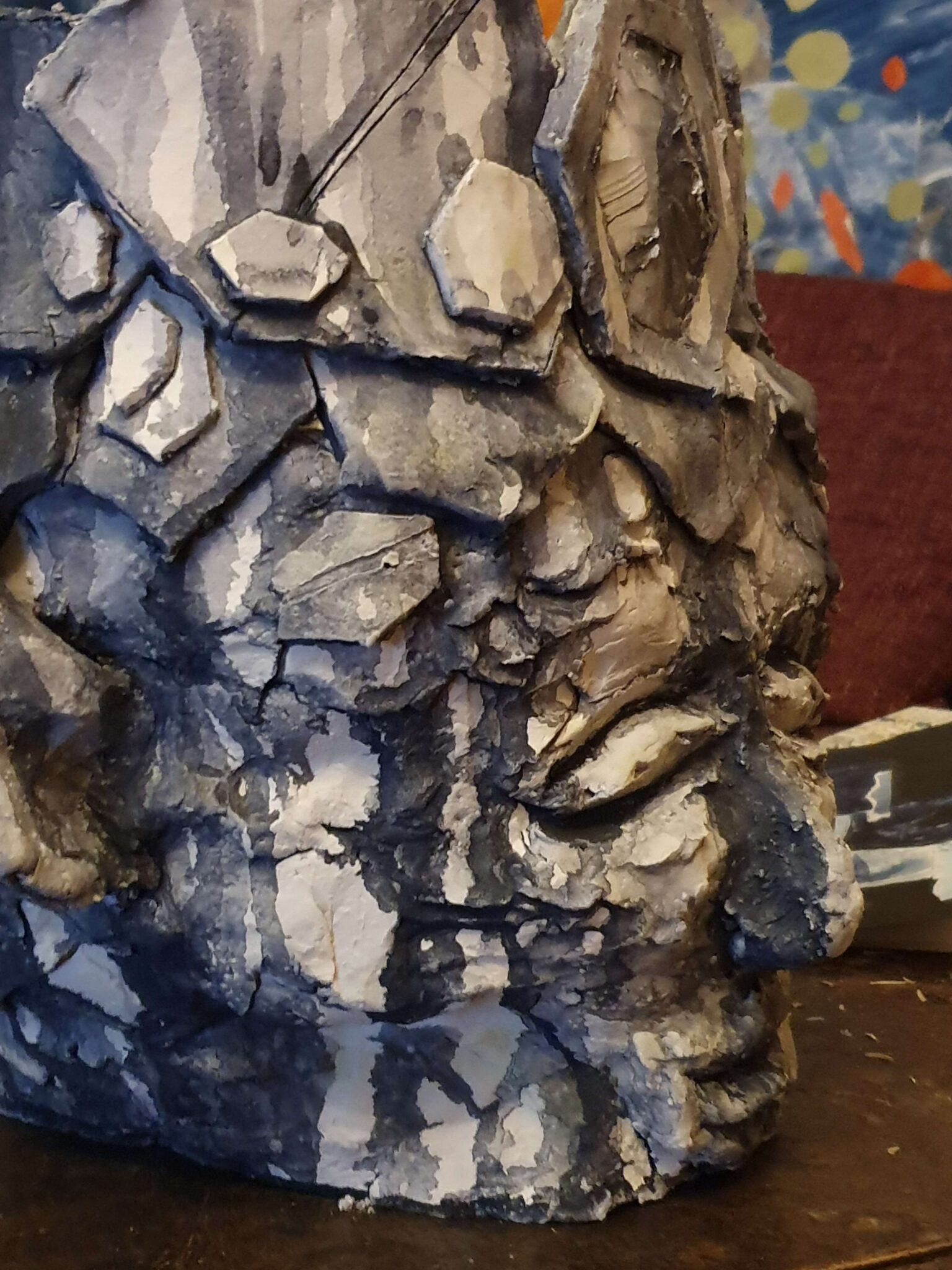
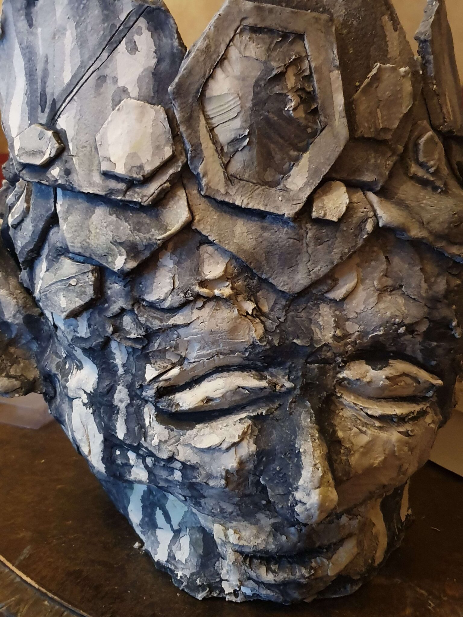
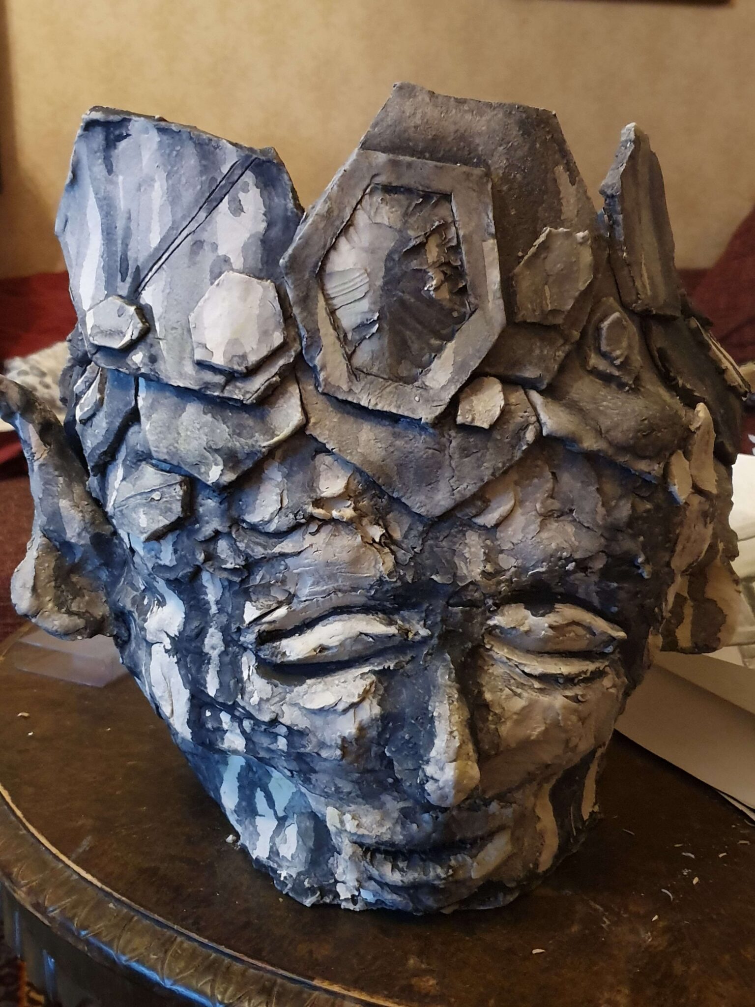
Work-in-progressSide profileFront profileFull-frontal viewKuningattaren Iltauinti (The Queen’s Night Swim), ceramic (2022)
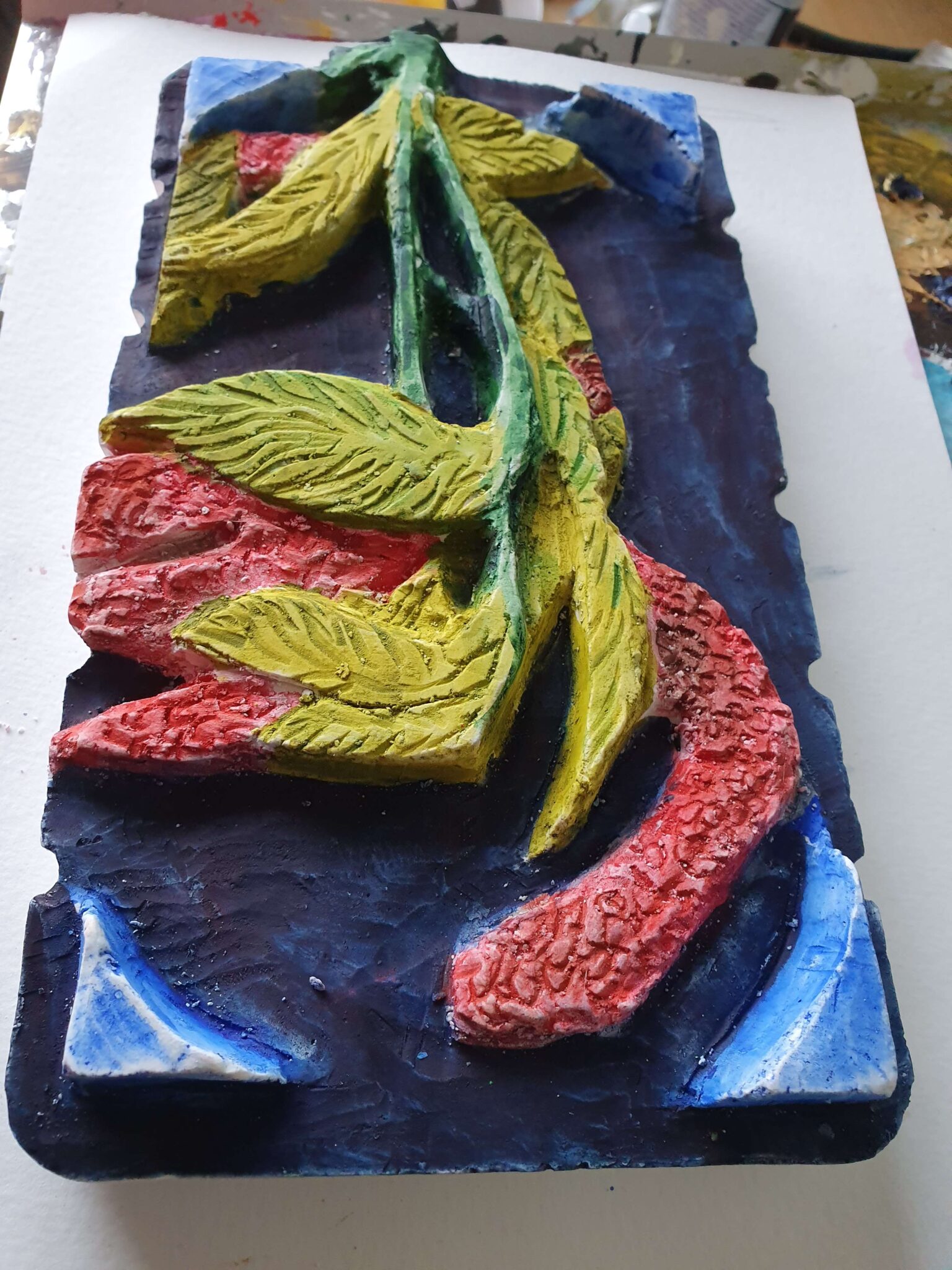
Due to the nature of the course and the medium used, this was both the piece I began working the first and the one I finished last. We had to wait for our ceramics to be heated in the oven for them to harden so we could finish the surface: mine was still hot on the final day when I got to finishing. The theme we were given was a queen taking a bath, from the neck up, and the medium is ceramic with an optional surface finish. I chose a rather fairytale-like subject, the old venerable queen bee that has left the hive, on her final swim. The hexagonal shapes that make up the crown are a nod to the geometric creations of bees, and the elf-like ears to the fairytale-like subject matter. The colouring and weathering have been created using liquid charcoal, in washes of various consistencies – it creates a striking effect that I really like, and that fits both the themes of water and age. I am really proud of this work.
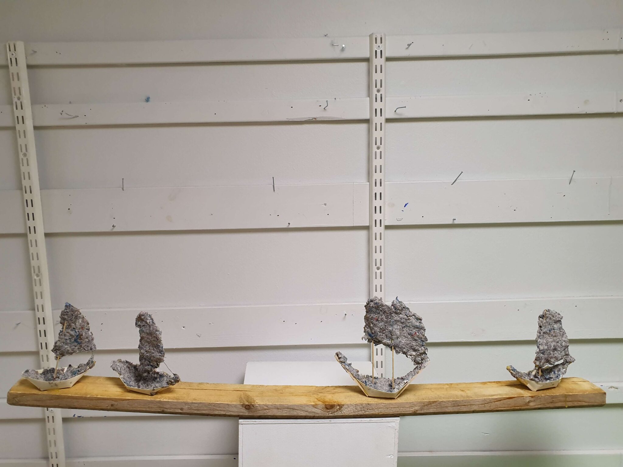
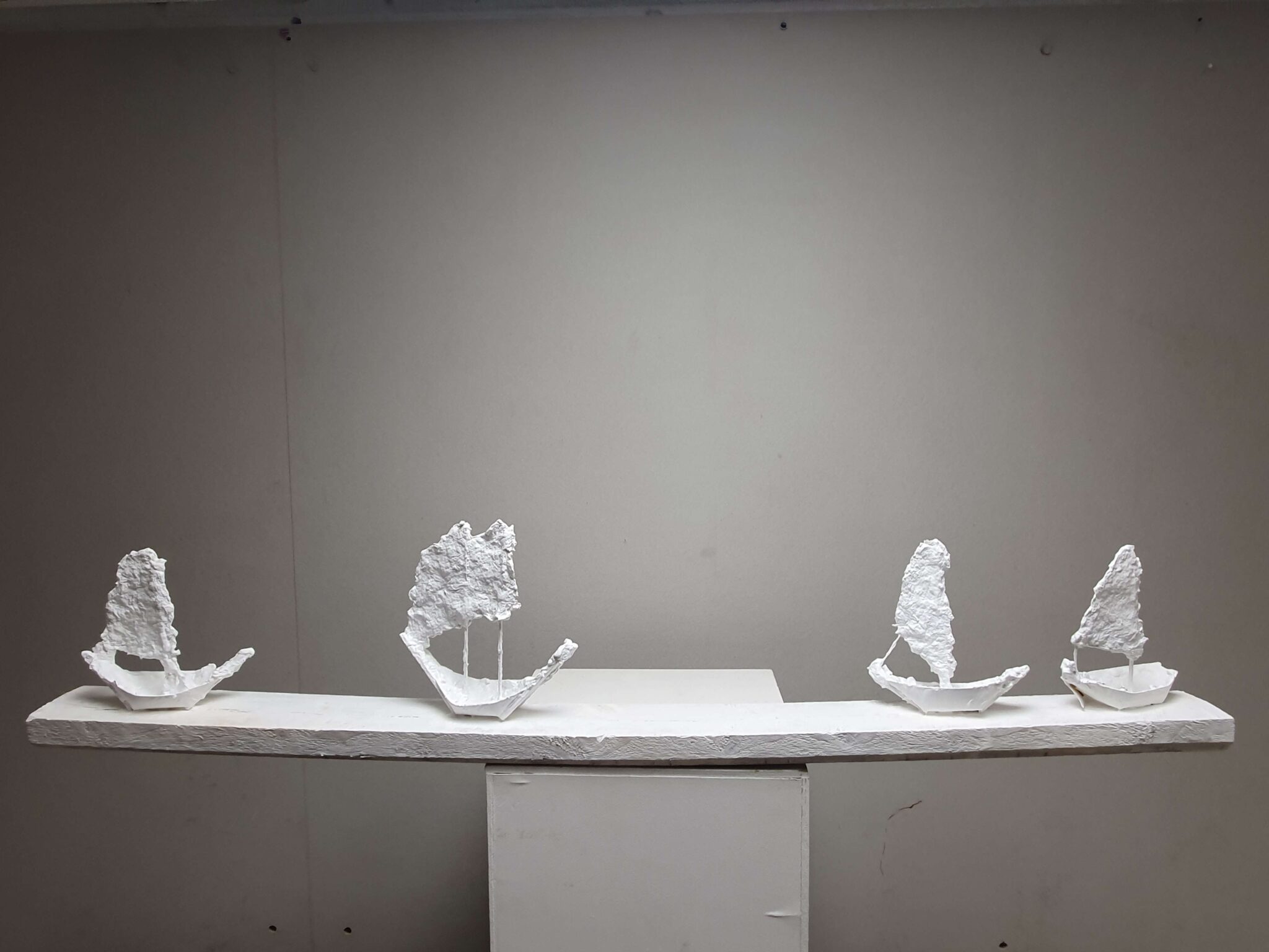
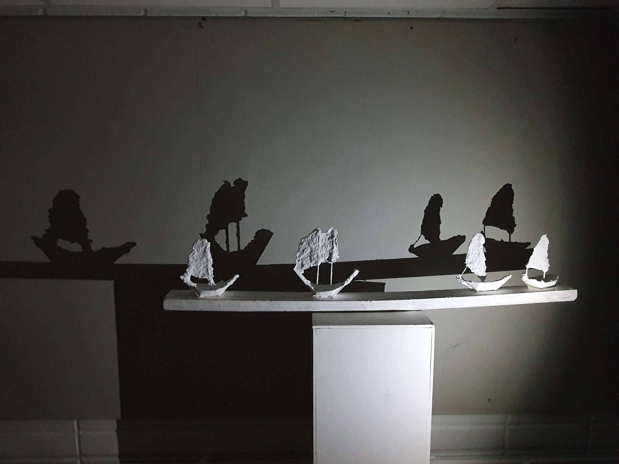
UnpaintedPaintedWith shadowsFinal pieceAamu-usva (The Morning Mist), wood and papier-mache (2022)
Our second work was making a poppy seed pod out of papier-mache, but mine still remains unfinished due to time constraints (the stem isn’t attached). Regardless, I’m more proud of The Morning Mist, above. It’s likewise made out of papier-mache, on a wooden base. I love how effective the simple arrangement is, and the shadows it casts double the number of ships in a beautiful manner. It creates a wonderful mood. The material took a while to get used to, but it creates a pleasant, rough, and unhewn surface texture once dry.
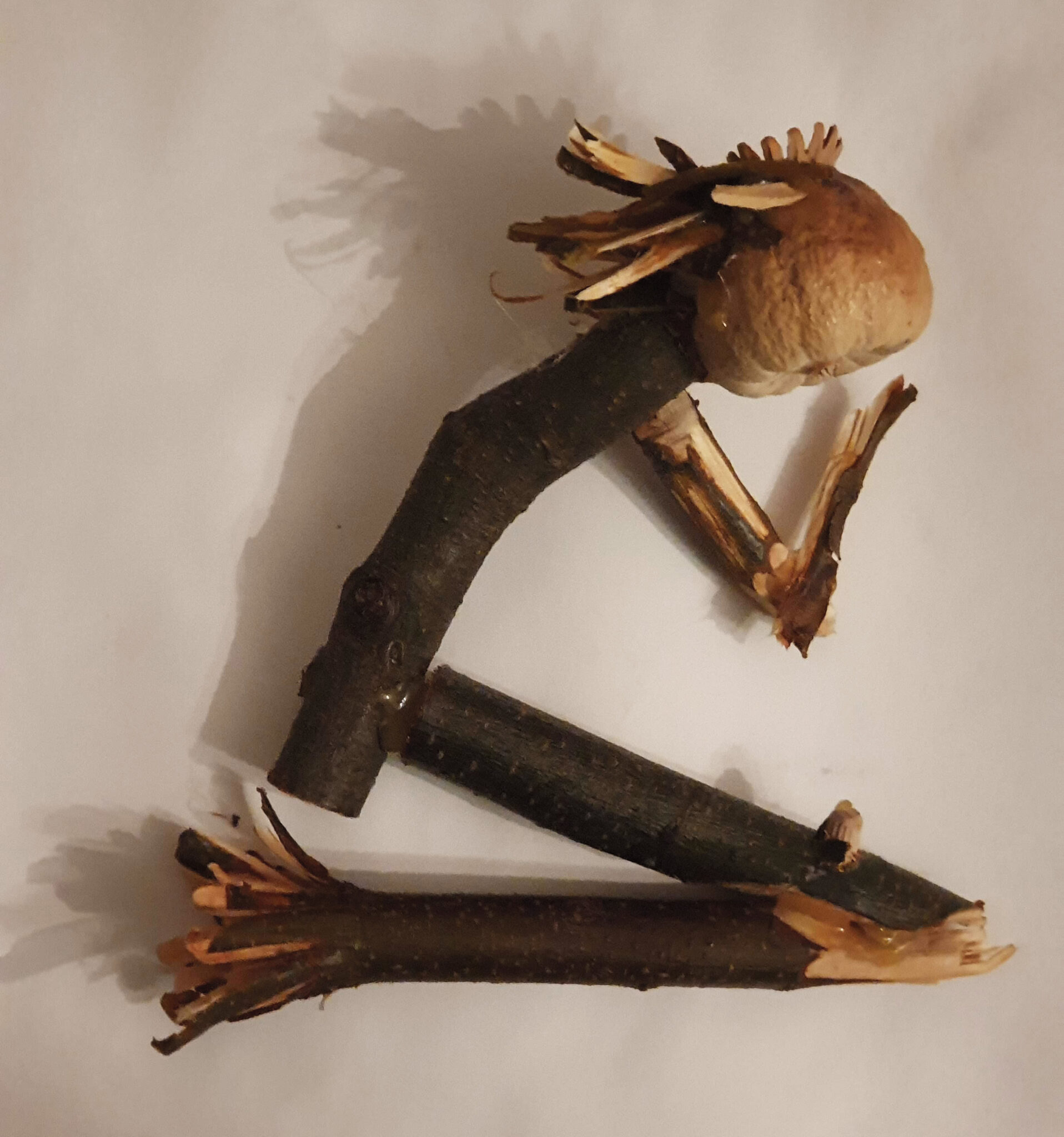
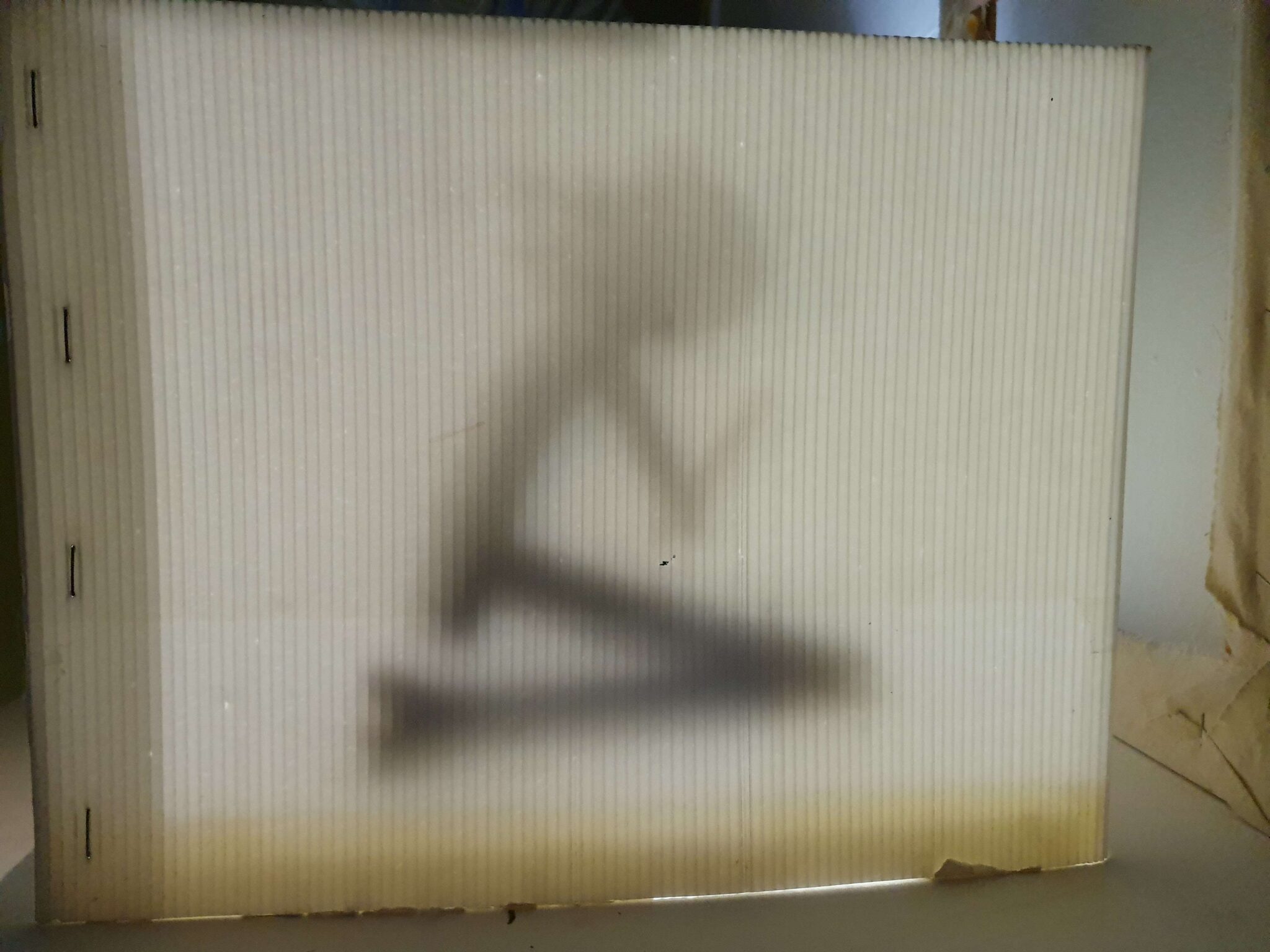
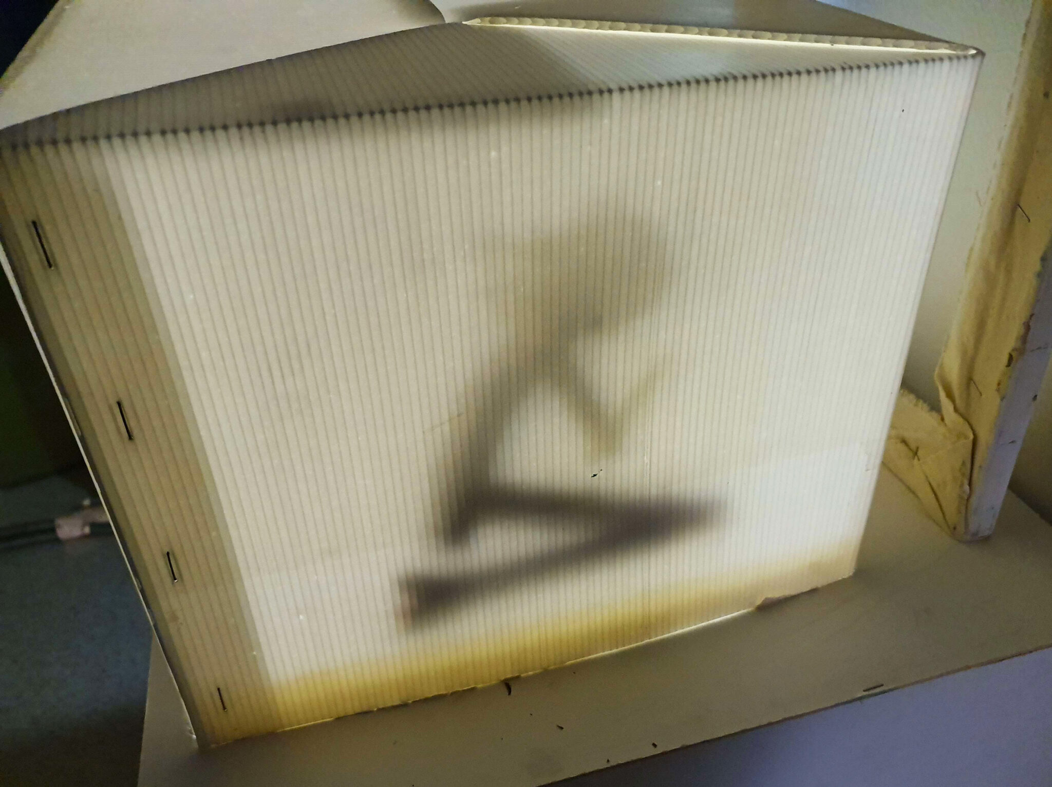
The wooden sculptShadowboxShadowboxLarger viewSilent Prayer, wood, cardboard, and light (2022)
Speaking of shadows, our next exercise was to create one. Well, to create a wooden sculpture that would cast a shadow, with the shadow itself being the important part in the artwork / exercise. The rather simple, and frankly voodoo-doll-looking sculpture is what I came up with: I do like how it’s gestural, and as such the shapes read rather well. I just feel like there’s something.. Traffic-sign-esque about it that I’m not a huge fan of. Overall the exercise was a success, though I’m not sure how I’m supposed to display this in my home, as it requires a rather specific lighting to look presentable.
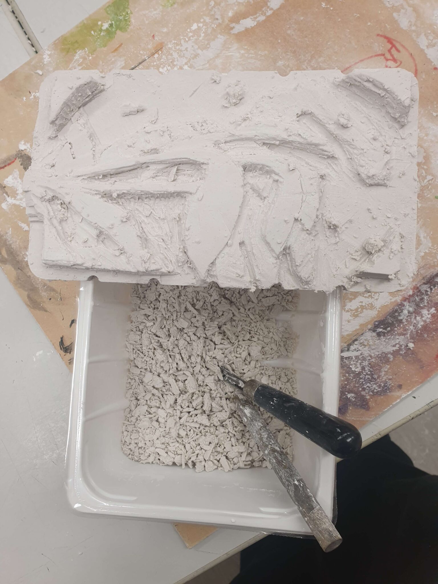
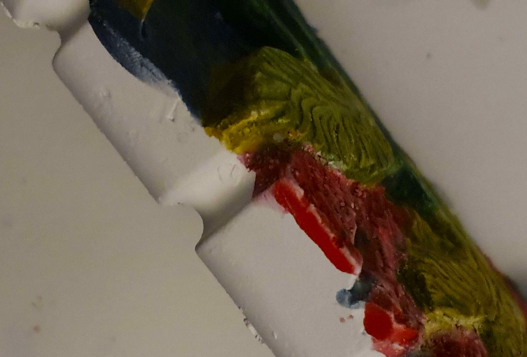
Ah, gypsum – the material of my nightmares. Not only is it dusty, it also likes to crack, and is generally unpleasant to work with. The resulting work isn’t particularly durable either – I’m constantly paranoid I’m going to drop this one while handling it. I was not very happy with it at any point during the creation process – the sculpting job itself isn’t particularly impressive – but after I decided to go experimental and paint it I was very happy with the results! I was afraid the watercolours I used to paint the sculpture would melt the gypsum, as it is slightly water-soluble, but my fears turned out to be (mostly) unwarranted: the water absorbed into the dry sculpture too fast to be able to dissolve anything, and the resulting surface is bright and pleasant to look at. The texture of the sculpt is accentuated and elevated by the paint. It almost makes me want to create another work in gypsum.
A delightful course, even if slightly short, but I am honestly quite happy with all the works I managed to finish. Working with different materials also felt much more tangible than merely painting on a canvas, and getting to work with your hands is always a pleasure. The ceramic sculpture remains my favourite – clay feels great in your hands as you work it – but I have to admit that painting the gypsum plaster relief was very enjoyable.
This course was extremely fun! I could really feel things that we had been taught previously come together on paper and canvas. Acrylic painting was a relatively new medium for me – I had primarily painted in gouache and watercolour before, so that posed some challenges but I feel like I got much more comfortable as the course went on.
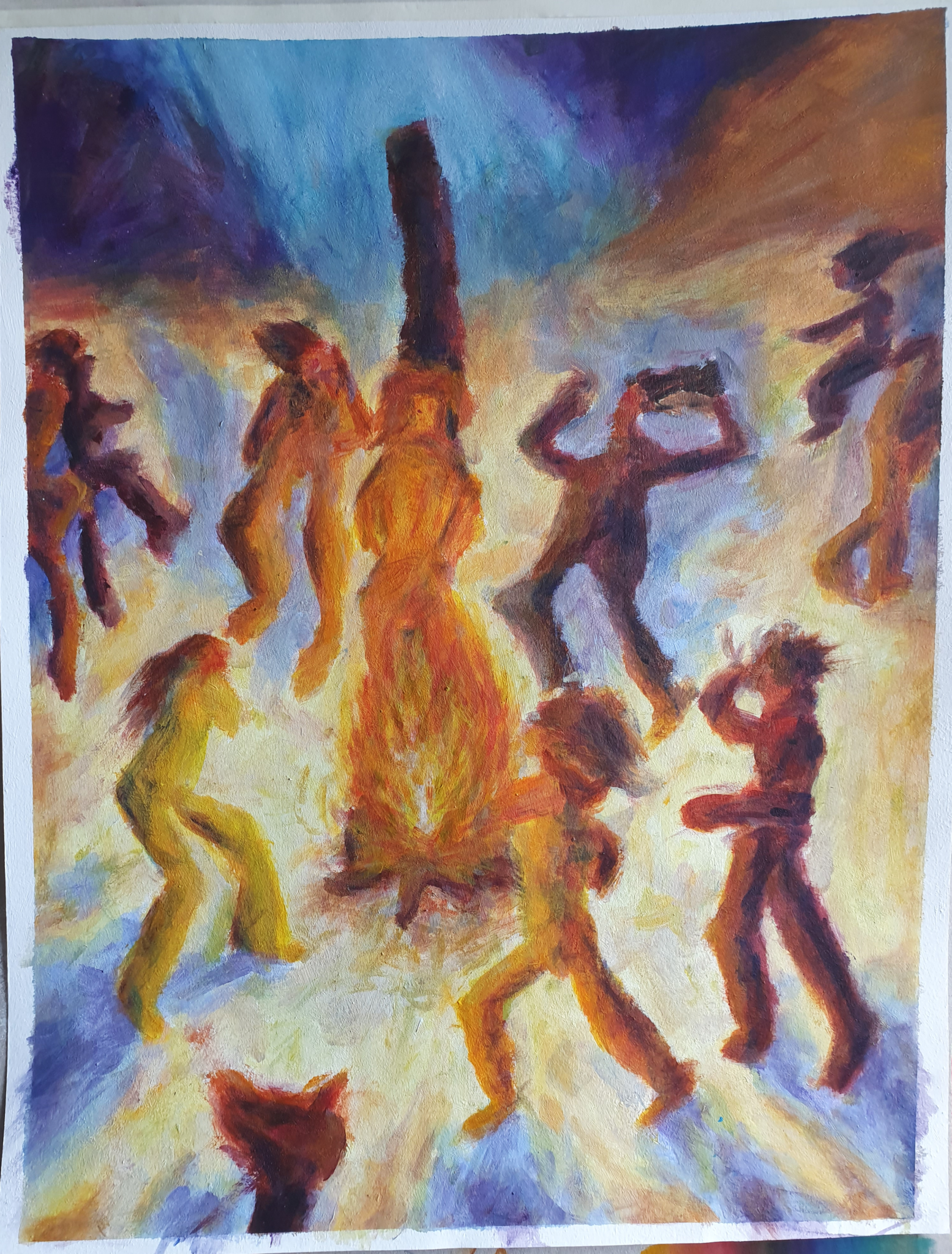
Poltellaan ja Joraillaan (Burning and Dancing), acrylic on paper (2022)
One of our tasks was to paint a pastiche, based on some historical artist. I chose Emil Nolde, a german expressionist painter, and more specifically his work of Dance around the Golden Calf (1910). I did an.. Acceptable job, I believe: The brushwork is not quite as thick and expressive, and for composition’s sake I should’ve included more overlap between the figures, but the colour and mood are rather successful.
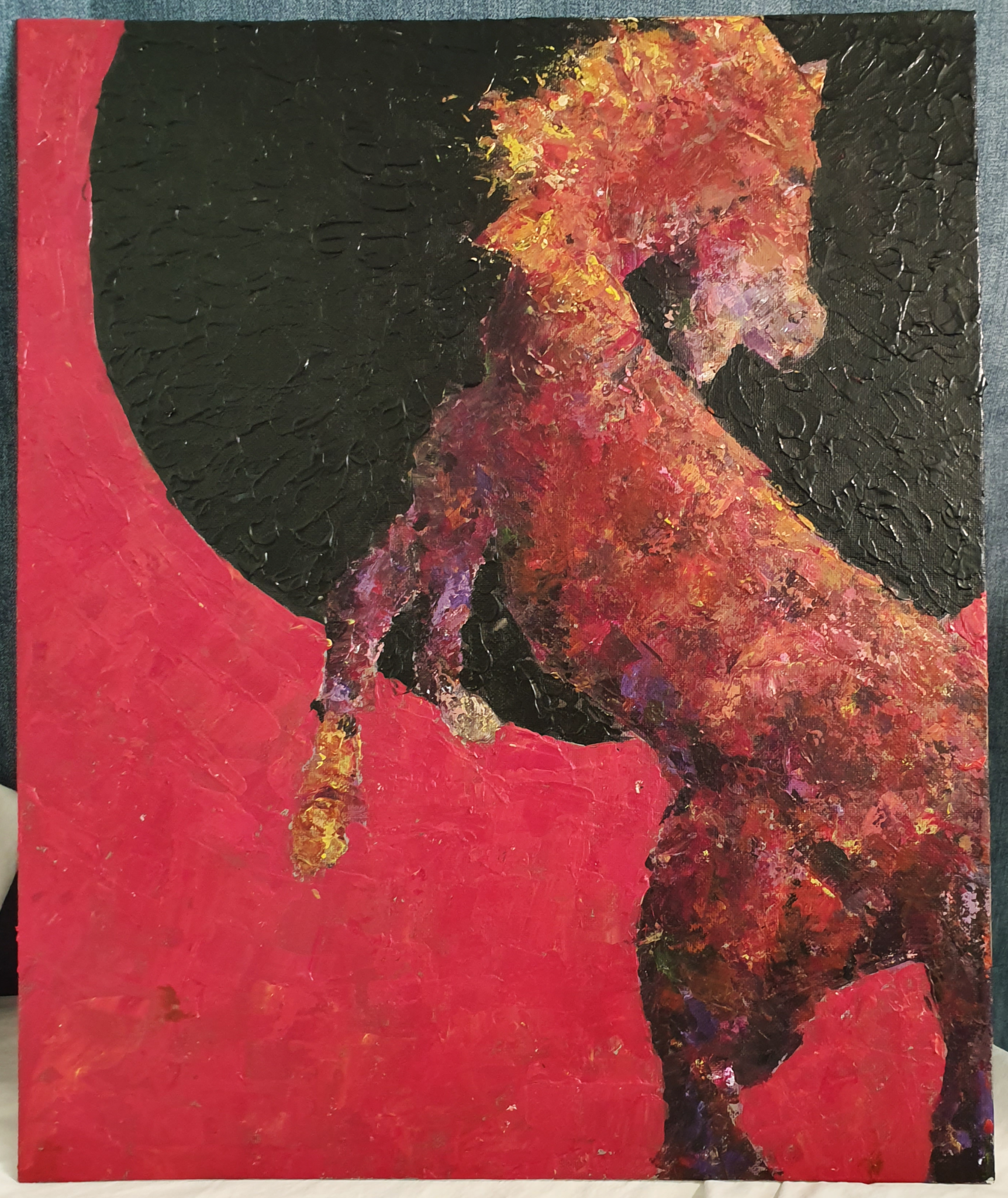
Namibian Aurinko (The Sun of Namibia), acrylic on canvas board (2022)
The inspiration for the work above came from horses left behind by European soldiers as they pulled back from Africa, specifically Namibia – the desert environment was not exactly a hospitable place for the horses, but one they could survive and thrive in without many dangerous predators. By now they’ve formed their own herds and arguably a breed of re-wilded horses in the area. I wanted to represent the scorching heat, the environment, but also the newfound freedom in this piece – and I felt like I really succeeded. I also noticed that I enjoy acrylic painting much more when I’m painting with a palette knife, rather than brushes.
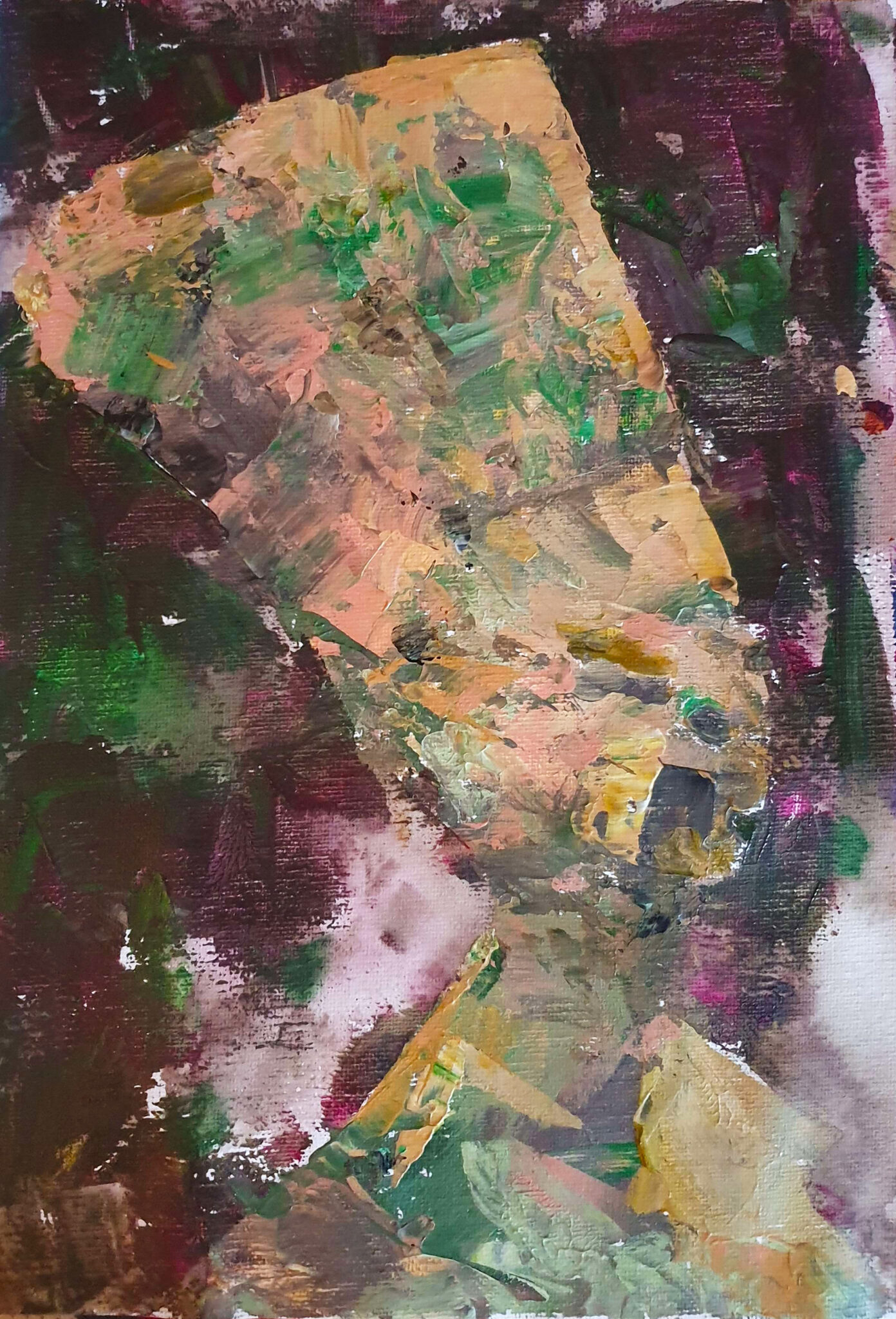
With colours I dislikedWith colours I likedTwo paintings of the plaster cast of Bust of Nefertiti, Acrylic on canvas (2022)
One of our exercises was picking limited colour palettes – one palette consisting exclusively of colours that we liked, and one from colours that we didn’t like, then paint the same subject with both. Time was limited, so I did quick semi-abstract paintings of the Bust of Nefertiti. To my surprise, the painting with the colours that I originally didn’tlike turned out to be much better. Part of that is undoubtedly the fact that the silhouette is more accurate, and the background is less noisy, but I was still surprised. It was definitely eye-opening to see that originally unpleasant colours could end up in a harmonious whole.
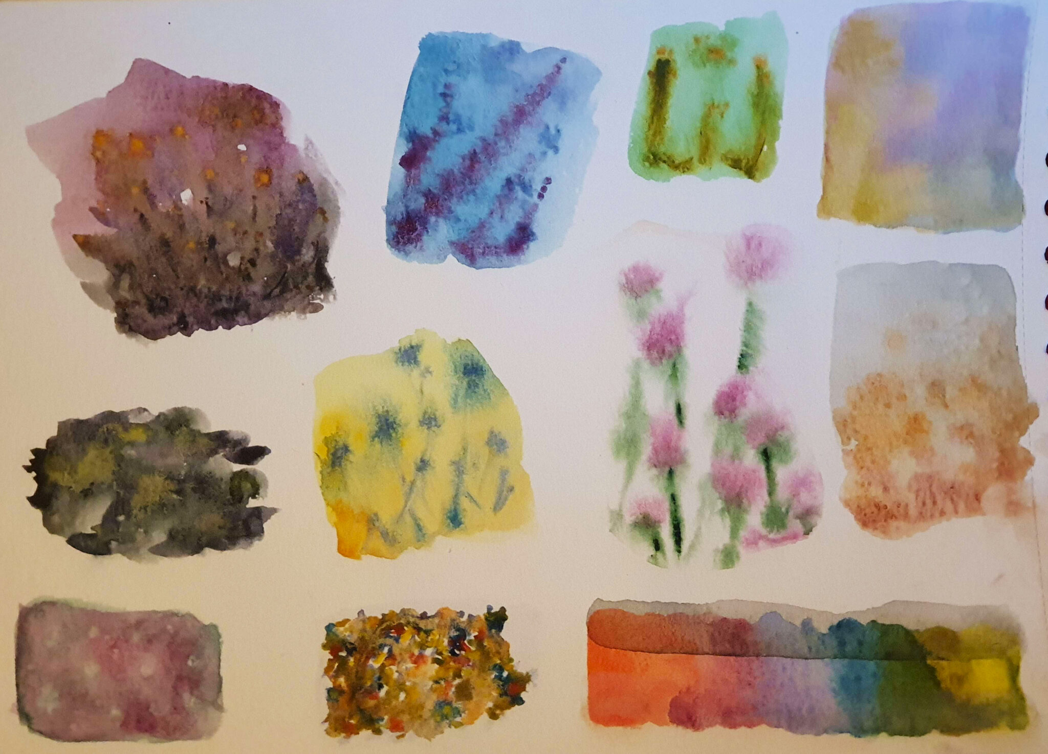
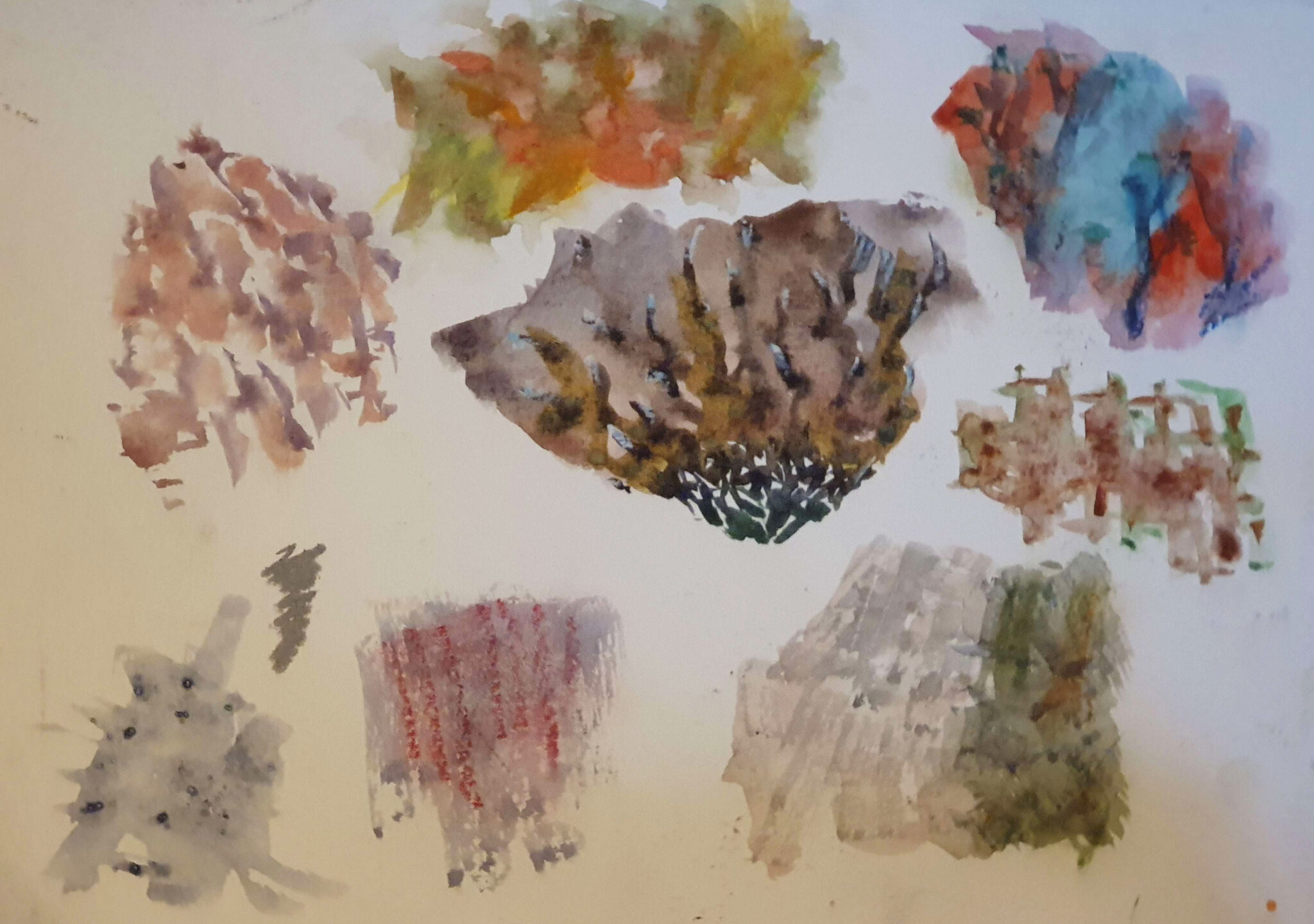
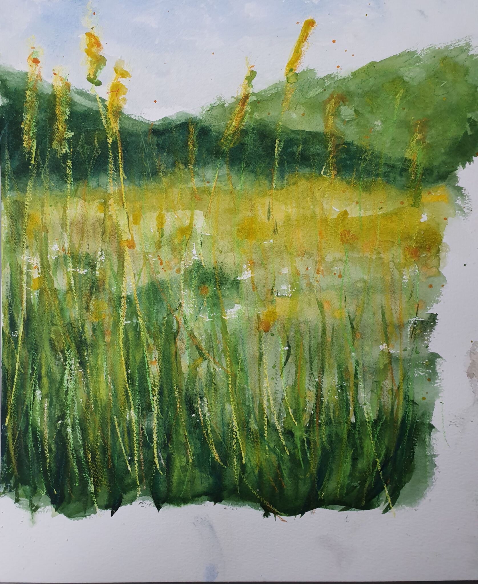
Various textures in watercolourVarious textures in watercolour and oil pastelPelto (Field), watercolour and wax Pastel (2022)
For watercolour we began with an exercise of painting different textures, using different techniques. Pictured above are wet-in-wet techniques with and without addition of oil pastel, the latter of which was put into practice in the vignette of a field, though utilizing wax pastels as a wax resist instead of oil pastels. We also tried methods such as adding salt crystals, cling film, aluminum foil, etc – too many to display here, and with various results in quality. Watercolours are a really versatile medium with a great range of expression. They lend themselves great not only to more abstract work, but representative pieces as well.
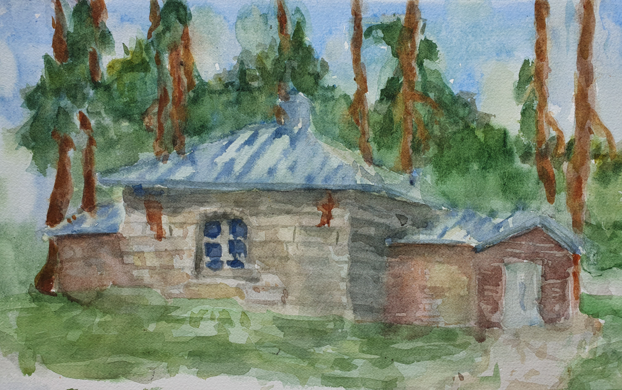
Sepän Paja (Smith’s Workshop), watercolour (2022)
The more representative example above was painted en plein air, which gives it a rather sketchy and immediate feeling. It is of a previous smith’s workshop which has been remodeled as a meditation / calming room, at the middle of the campus of University of Jyväskylä. The light changed numerous times even in the short period I had to paint it, which proved to be really challenging.
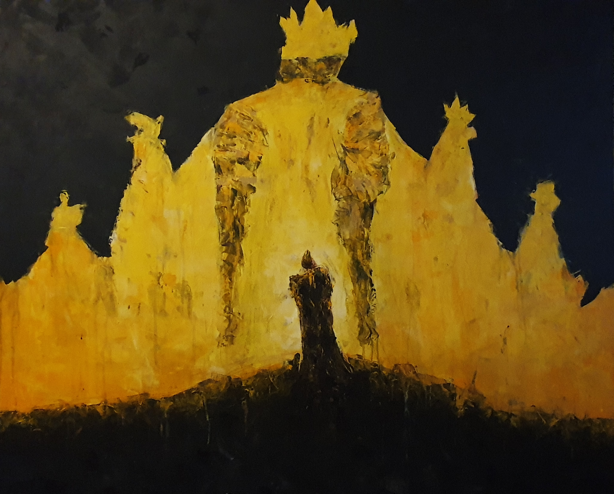
The King in Yellow, acrylic on MDF board (2022)
Our final project of the class was to paint something large – my painting was 120 by 100 centimeters, and felt like an absolutely gigantic endeavour at first. The title and inspiration has been taken from an early example of weird / horror fiction, a short story compilation by the same name written by Robert W. Chambers, published din 1895. It deals with the themes of grandiose, but perhaps unwanted and undesirable destiny. After I had gotten to it, it was a joy to paint – there’s something physically pleasurable about working on a larger surface, where you can use more of your body to create expressive marks. I am glad about how it turned out, and the limited colour palette of only yellows, browns, and blacks works really well to accentuate the mystical but grandiose feeling I was going for.
As I said at the beginning of this post, this course was extremely fun! Painting is a preferred form of visual expression for many, and I can definitely see why. I’ve taken things I’ve learned from this course and already applied them to my art outside of the degree, and that’s a great sign of a successful course.
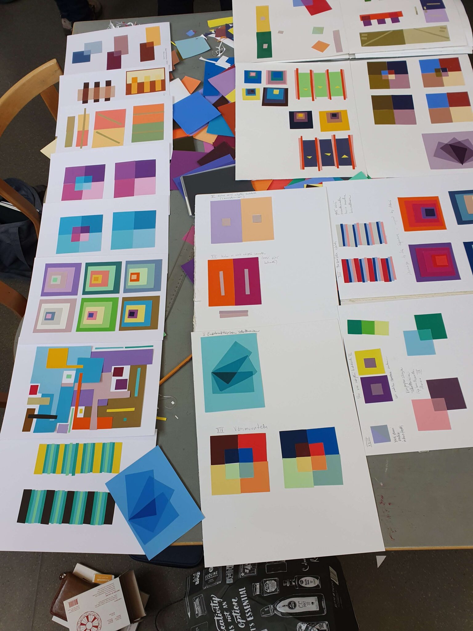
After the drawing course it was time for our long-awaited foray into colour – more specifically colour theory (Fin: Värioppi). This was something most of us welcomed with open arms after months of monochromatic charcoal and graphite drawing. Our teacher on this course was the artist Kristiina Lempiäinen-Trzaska.
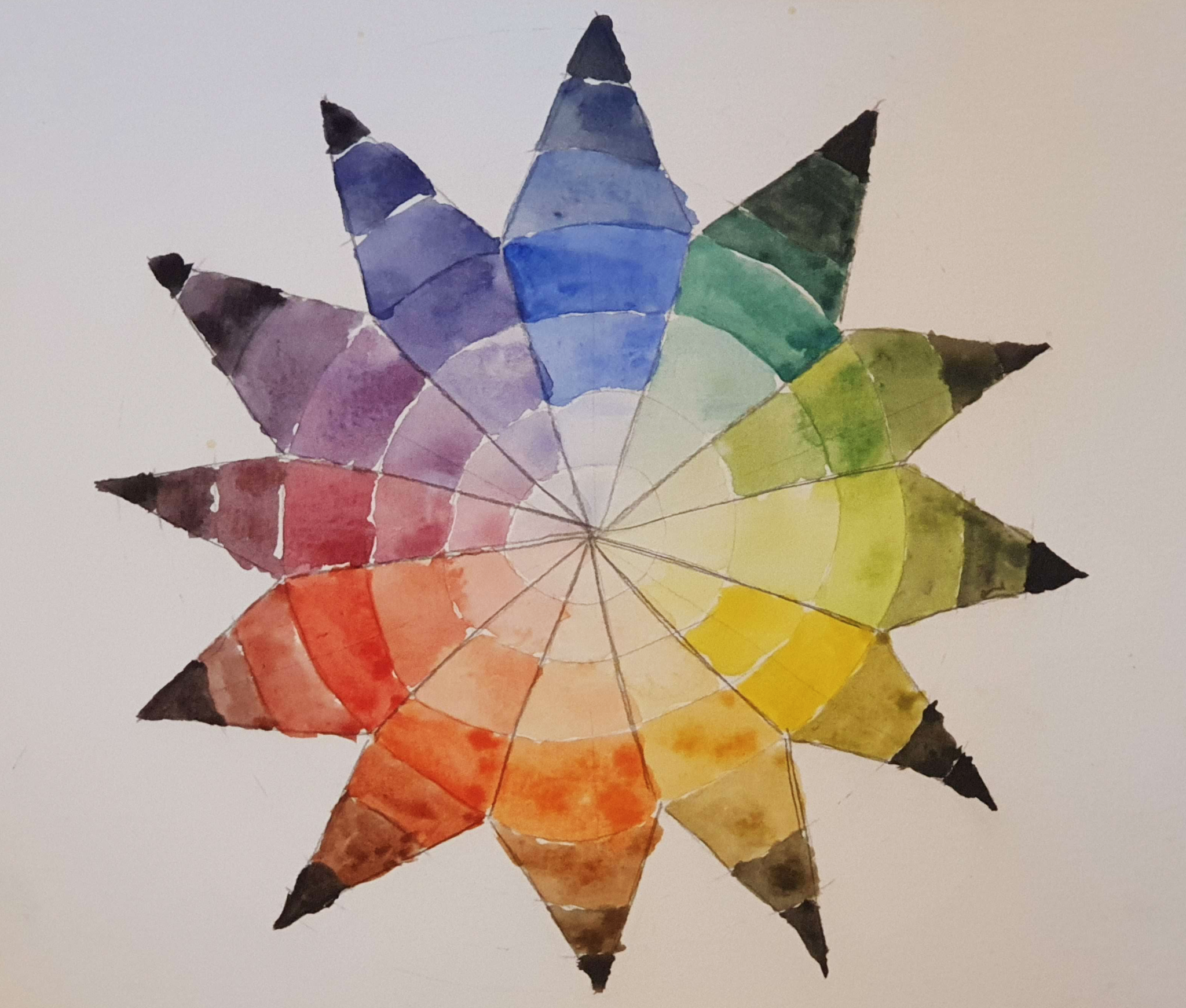
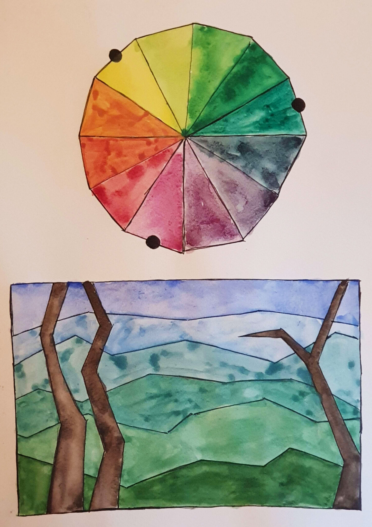
Goethe’s Colour star
The course drew heavily on classical colour theory and different colour theorists. Goethe, Itten, Albers were all featured. We completed basic exercises in colour mixing and colour harmony, finished a good number of colour wheels of different sorts, an example of which is the Goethe’s colour star above.
Really, the course was a mix of practical colour theory and history of colour theory. A lot of people have had rather.. Peculiar ideas about colour, shall we say. All of Itten, Goethe, and Albers seemed to ascribe something mystical to colour, which I am not sure I fully agree with. To me a lot of it sounded like horoscopes for artists, and to this day it is not clear to me what the logic between Albers’ distinction of wet and dry colours is.
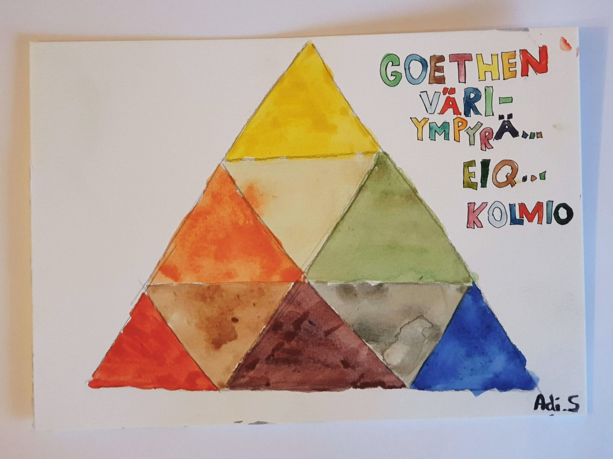
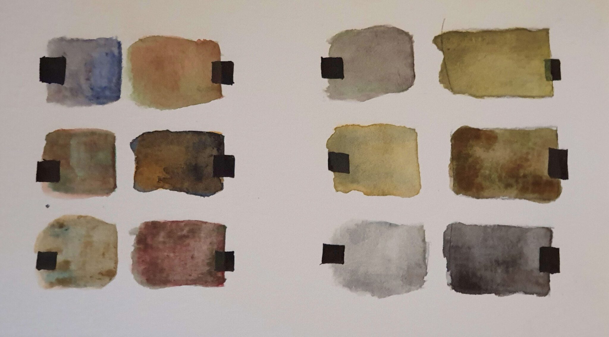
Goethe’s Colour TriangleColour Wheel and Air PerspectiveColour Groupings Mixing various grays and muted colours in watercolourVarious exercises from the first half of the course
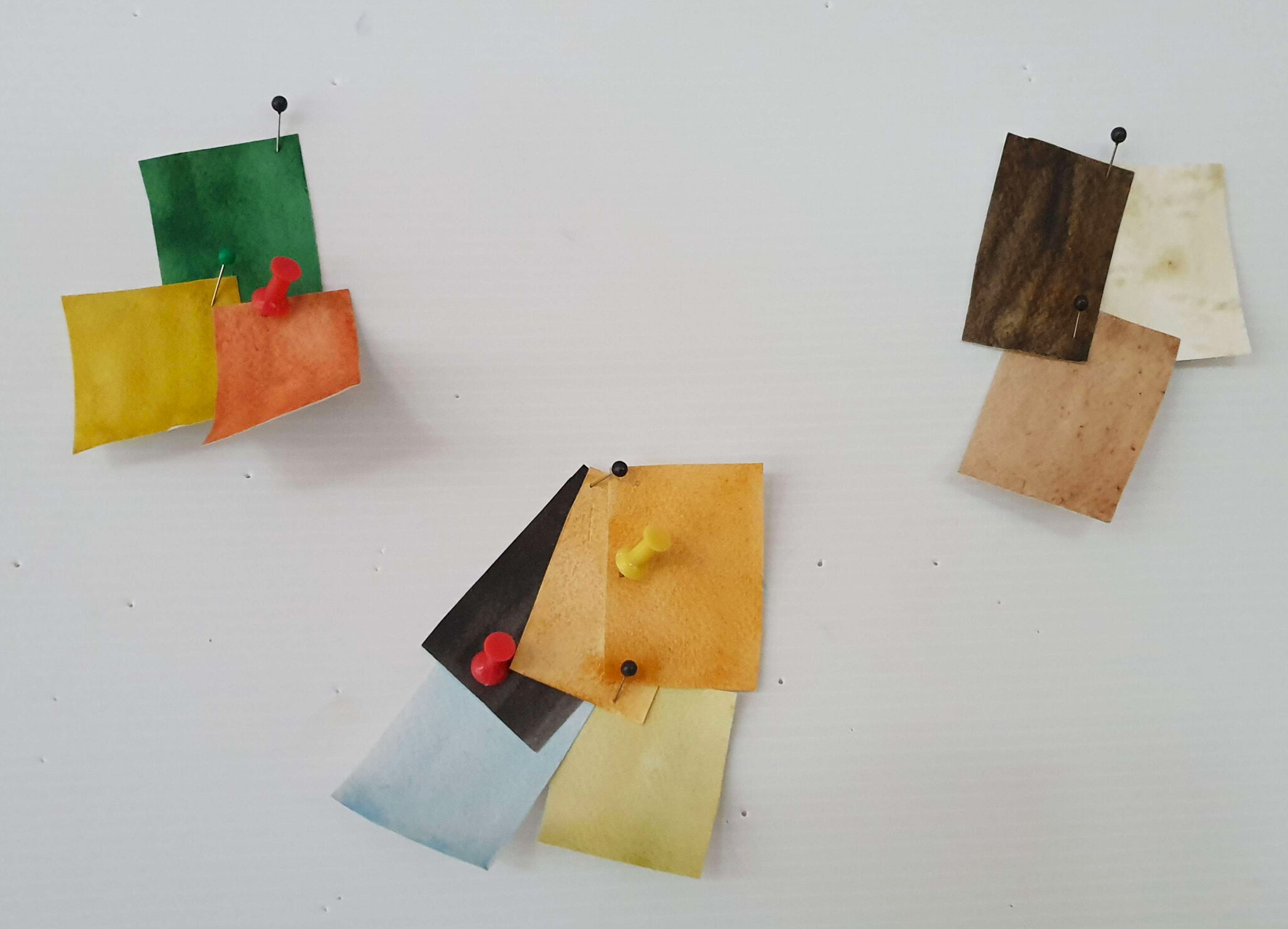
For the first half of the course we worked primarily in watercolour (or gouache), and focused on Goethe and Itten. The latter half focused on Josef Albers’ book Interaction of Colour (1963) – a classic of visual arts education. The exercises from the book were done using Color-Aid acid-free paper.
Trying to find “pure” yellow, green, blue, purple, red, and orange: Different groups of students in different columns. There’s a pretty good consensus, but definitely also differences in perception.
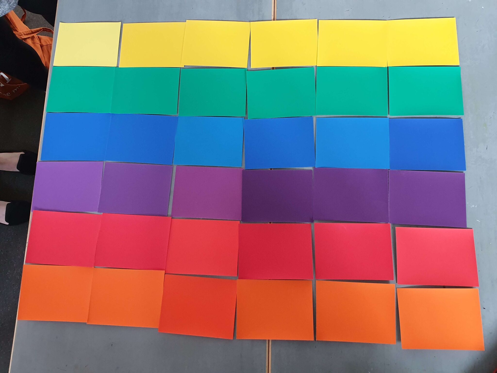
The book and our course focused heavily, as the name of the book might imply, on the interaction between colours. Dark colours make others near them appear lighter, strongly saturated greens make the surrounding colours appear more purple, etc. I highly recommend checking out the book from your local library (or from Amazon, if you’d prefer) if you want to know more about the specifics: Albers lists like twenty or so different forms of possible interactions, and these can combine in various ways.
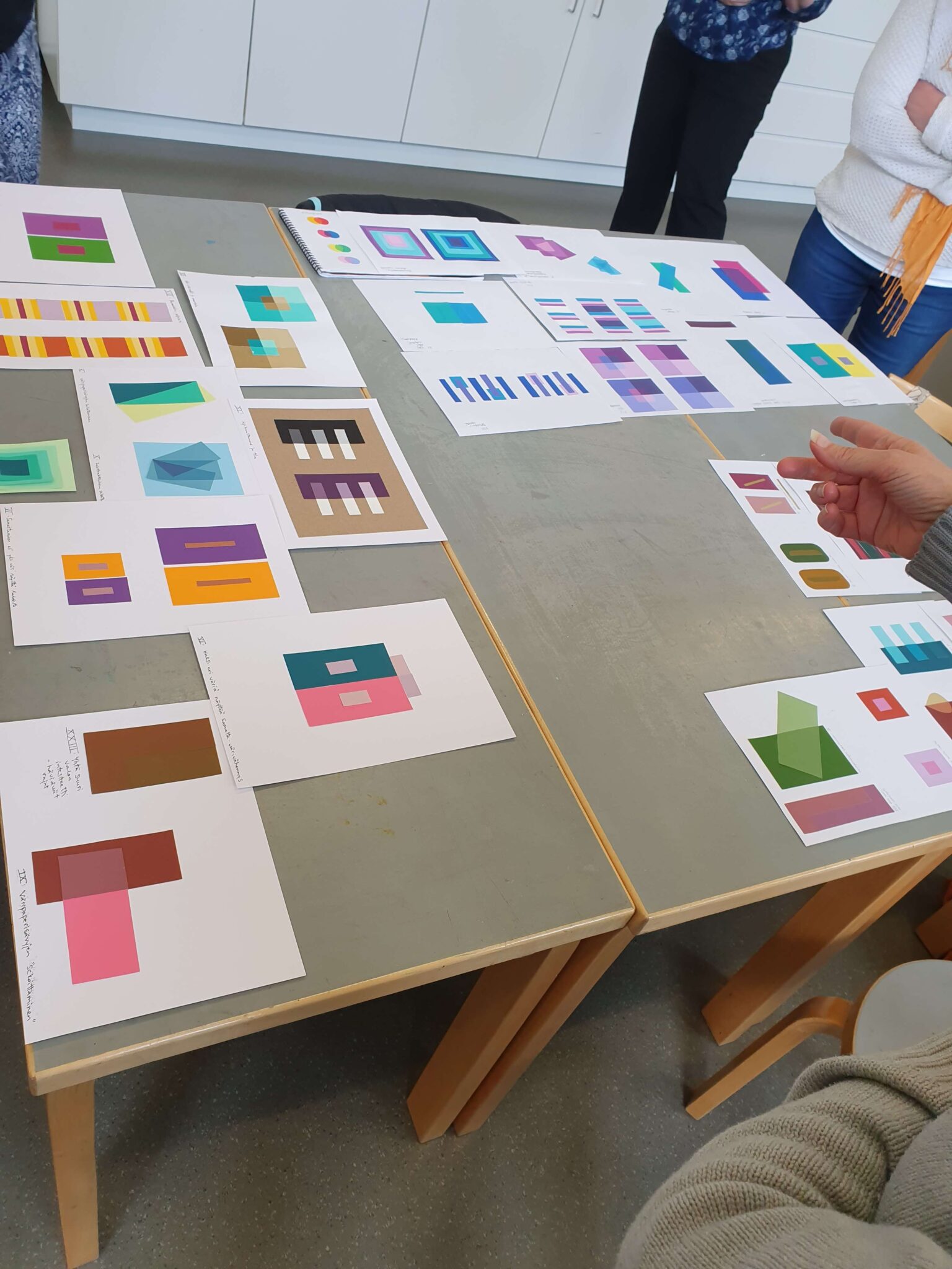
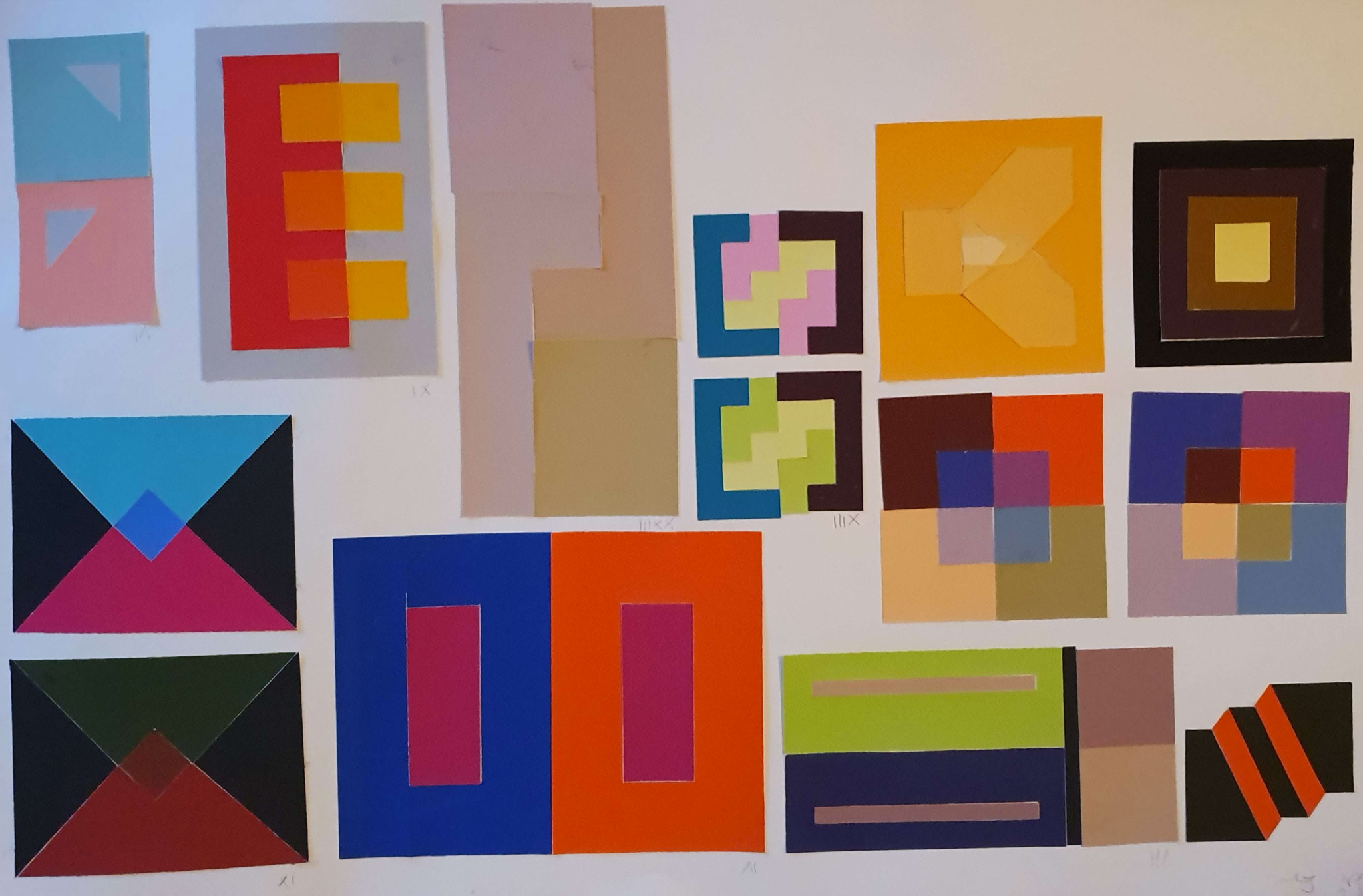
Different students’ works.Different students’ works.We got all kinds of results, from successful to unsuccessful.
The modus operandi was gluing pieces of Color-Aid paper to get the desired effects and results. Albers does outline general suggested layouts, but the resulting effect is the important part and we were allowed to freestyle and experiment a fair bit. It was a great experience comparing results we got, and how much minutae differences in the surface area of a given colour can affect the illusion’s believability. Photographing these accurately is nigh-on impossible, or at least would take photography skills (and equipment?) much better than my own.
My exercises.
I learned a lot about colour during the course, and confirmed quite a bit that I had previously intuited. I also enjoyed hearing the history of colour theory. That being said, I am sure there ought to be a better method than precisely gluing flimsy pieces of paper on cardboard with perfect tolerances! Even a tiny gap between the papers would immediately compromise the whole effect, and you simply had to cut the papers with a craft knife to get the clean edge required. This took forever and at parts I felt like the main thing I was learning was how to glue paper properly.
I also wished that the course would’ve gone on to more modern colour theory: there have been plenty of advances, and things like process colour and how it affects printing is very interesting. Digitally colour is also handled very differently, as an additive rather than subtractive process, and many modern artists work digitally. Perhaps I’m just more scientifically-minded about the properties, rather than the at-times touchy-feely vibe that the earlier colour theorists seemed to follow. Still, as I said – I learned a lot. In that regard, the course was a great success.
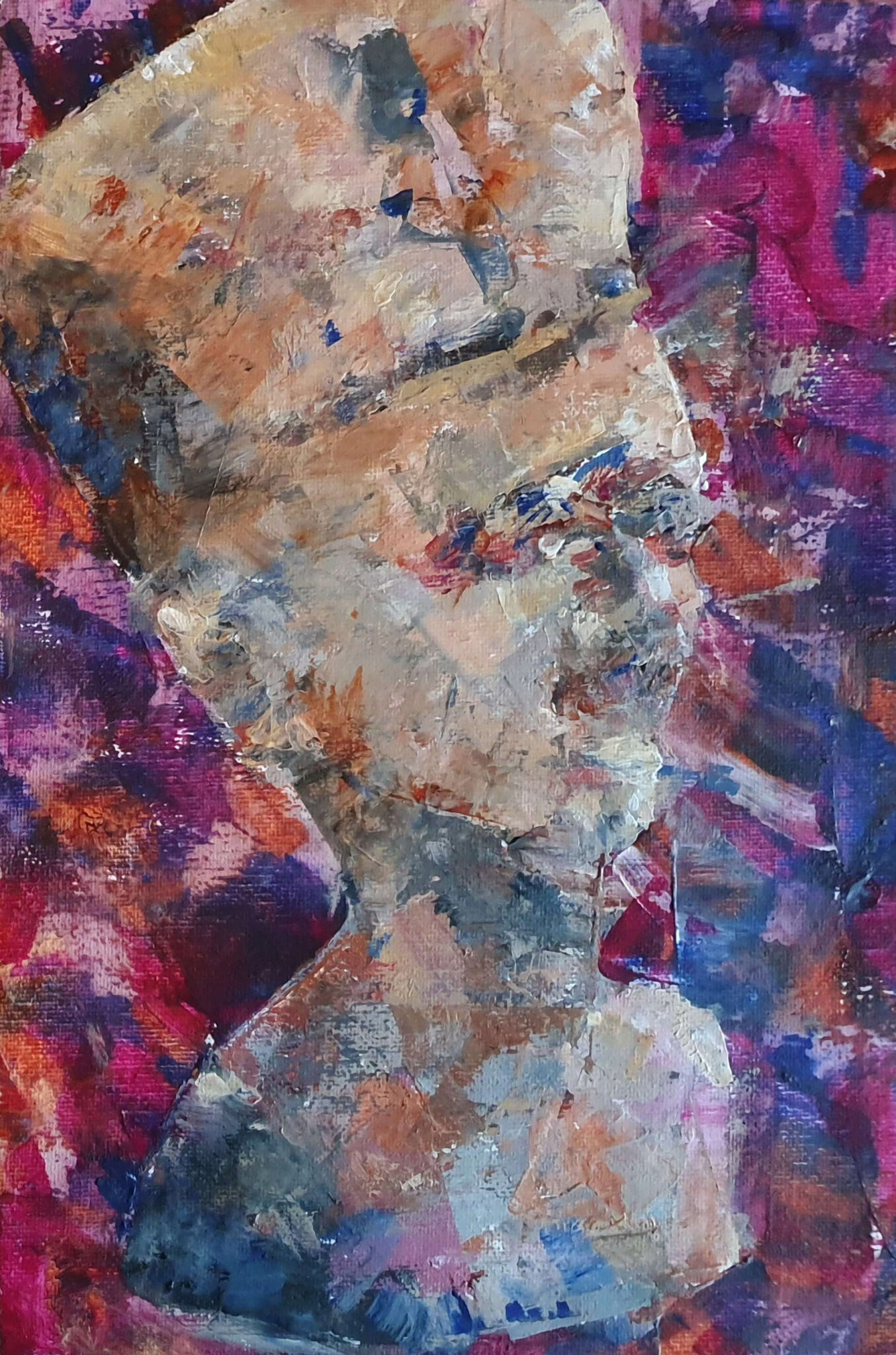
Our second course of the semester was on Observational Drawing (Fin: Havaintopiirrustus) – perhaps the fundamental of the fundamentals of visual arts. For the uninitiated, observational drawing is basically drawing what one sees, though we also did go through some constructive drawing techniques such as perspective. Our teacher for this course was the artist Mari Antjärvi.
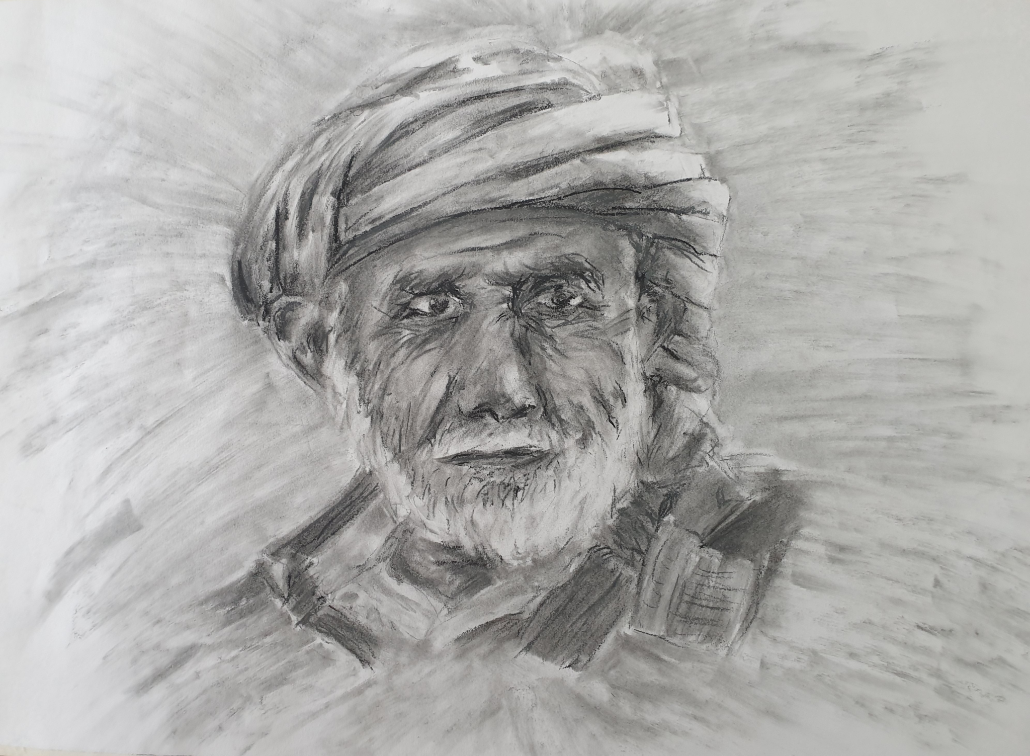
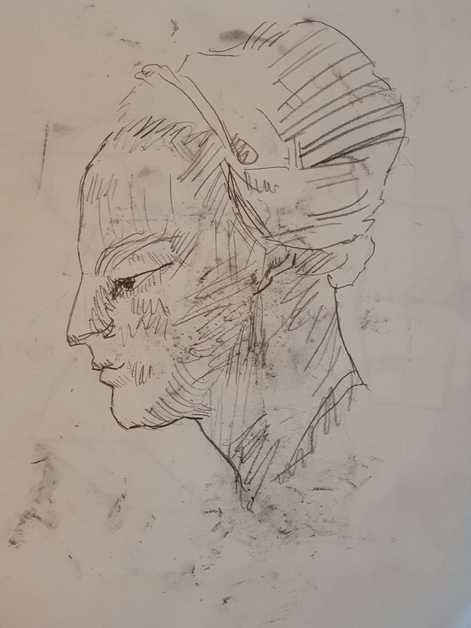
Portrait study, charcoal (2022)
The portrait above is my personal favourite among the works I produced during this class. It was from the latter part of the class, and shows that I had improved a fair bit throughout. The turban and beard were challenging, but I feel like I captured the mood of the person quite well. It’s in charcoal which, alongside graphite, formed the main mediums of the course.
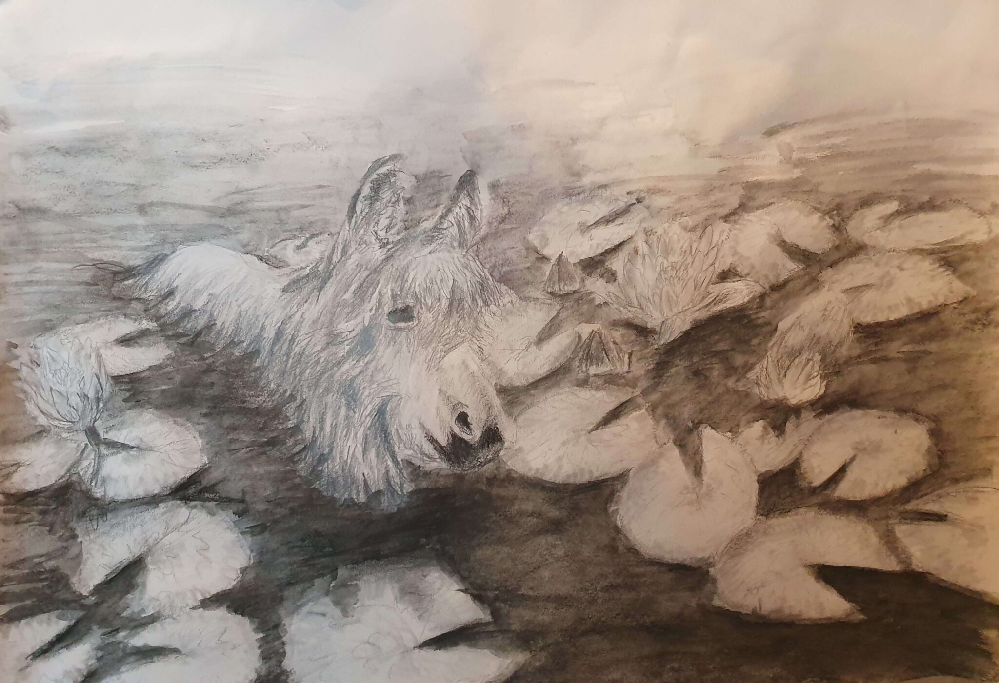
Ojasta Allikkoon, charcoal and graphite (2022)
This picture of a donkey in a pond was a peer-favourite during the course. The task was to draw an animal – though admittedly I ended up partially painting one: the water of the pond is compressed charcoal brushed around with a bit of water. There are many things in this work that I’m not content with, but considering the reactions it certainly has some appeal. I suppose it often is the case that what we as artists are happy with and what the audience likes do not necessarily coincide.
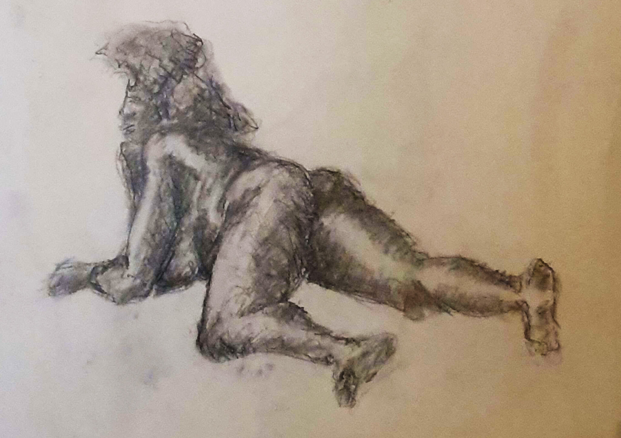
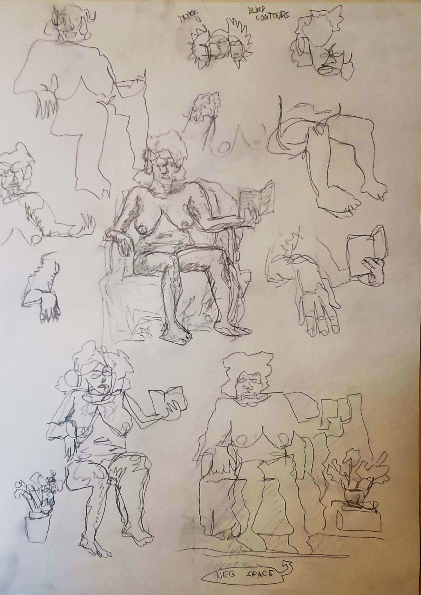
One of the greatest opportunities we had was drawing from a live model. Both clothed and nude. We did quick croquis, from 30 seconds to a minute each, longer live drawings, blind contour drawings, value studies etc. This was the first time I drew from a live model and also the first time I drew someone with a dark skin – I fully admit that both of these gave me a lot of trouble. I especially found it difficult to accurately represent the model’s skin: rather than focusing on shadows, I had to focus on the highlights to give a sense of the skin’s reflectivity and sheen. I do not feel like I did the model justice in that regard, despite my best efforts.
Regardless, these exercises were something I greatly enjoyed, and something that really improved my drawing skills. I will certainly aim to attend a more specialized live-drawing course in the future to hone my skills further.
Frog statue and CandleMaster Study after MichelangeloProgressive drawingVarious exercises
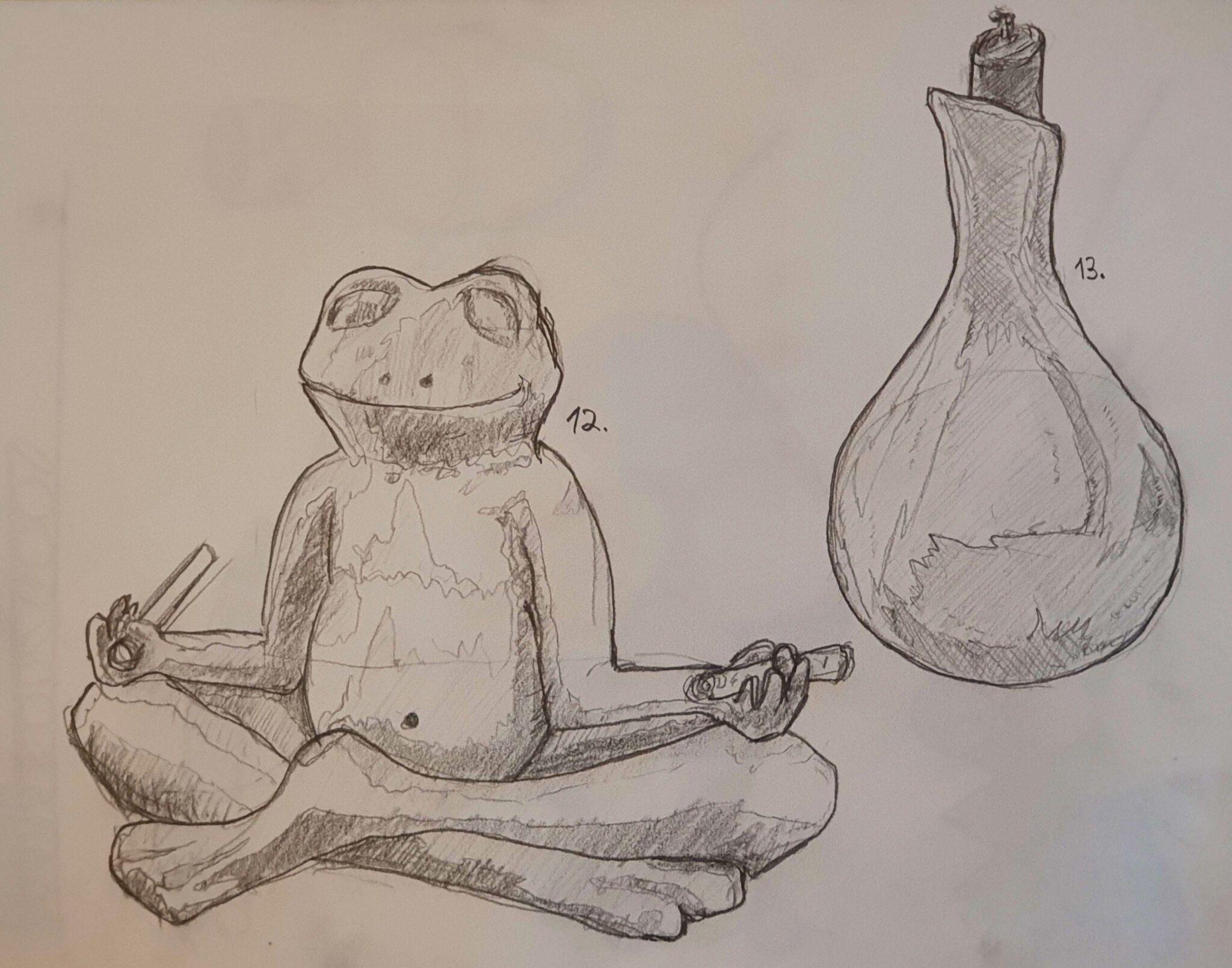
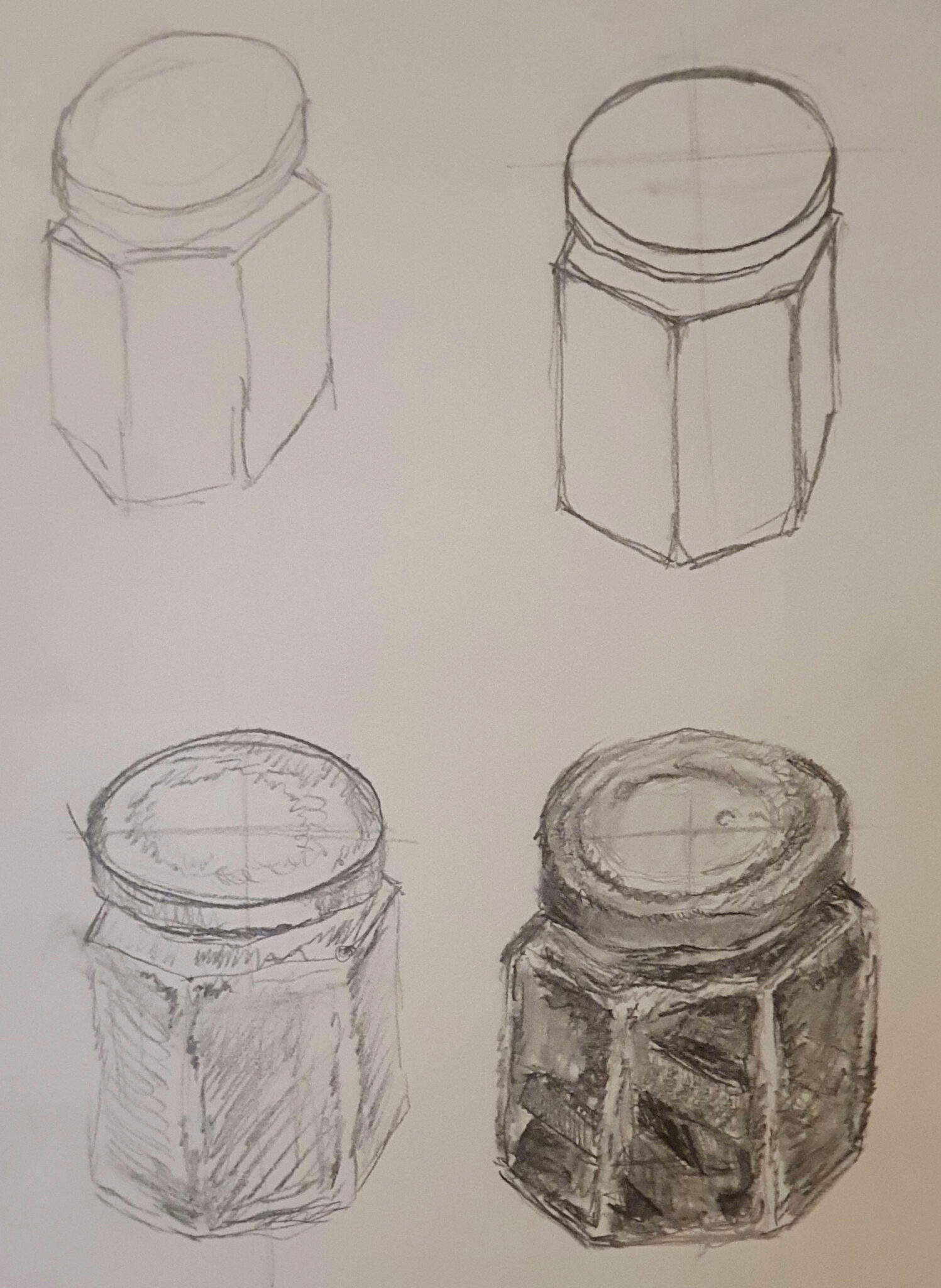
Beyond live model drawing and the few larger finished works above, we did a lot of different faster exercises. I am quite proud of the quick master study after Michelangelo, but the progressive drawing where we drew the same thing multiple times was also great practice. I also kept a sketch diary throughout the course, where I drew various household items – the frog and candlestand on the left are from that series.
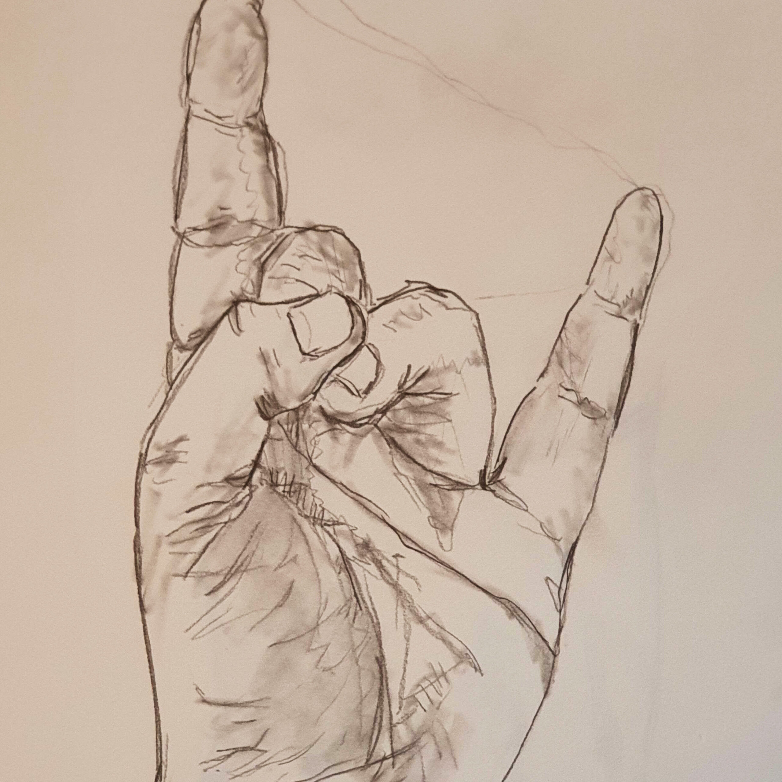
Hand Study (2022)
Drawing is truly fundamental for visual arts, and as such something one can never do too much – or even enough. I wished that more time would’ve been devoted to this skill, but unfortunately time is a limited resource and courses can’t go on forever. Still, first and foremost, I learned how to practice, so I could more fruitfully spend my own free time improving at the subject.
Our studies for the 25-credit basics portion for a BA in Visual Arts, organized in cooperation between the University of Lapland and the Summer University of Jyväskylä, began with a course titled “Johdatus taiteelliseen ajatteluun ja pajoihin” (Eng. Introduction to Artistic Thinking and Workshops). As the title makes clear, this was an introductory course that combined theory (the artistic thinking part) and practice (the workshops part).
Due to the Covid situation in Finland at the time, the first lectures were done remotely using Zoom. At the beginning we introduced ourselves, but very quickly moved to practice: Drawing/painting quick portraits of each other, basic perspective exercise, etc. We were also instructed to keep a daily drawing diary of sorts: In the end I compiled mine into a scroll about couple meters long by taping the papers together. Earlier parts were in pencil, later parts were drawn using a brush and watercolour – my new brushes had just arrived and I couldn’t wait to get to use them.
Daily drawing diary from 14.1.2022 to 19.2.2022
This interweaving of theoretical and practical work continued throughout the course. We wrote article reports for art-related articles and discussed the subjects. Mine was on the article “Forget the Metaverse; It’s Time for Artists to Enter the ‘Mutaverse’” (ArtReview 2.2.2022), which I found most interesting and relevant to the contemporary art scene and its future. It was exciting getting to know people this way, seeing what kind of articles piqued their interests. To further help us get introduced, we also created self-portraits using collage techniques.
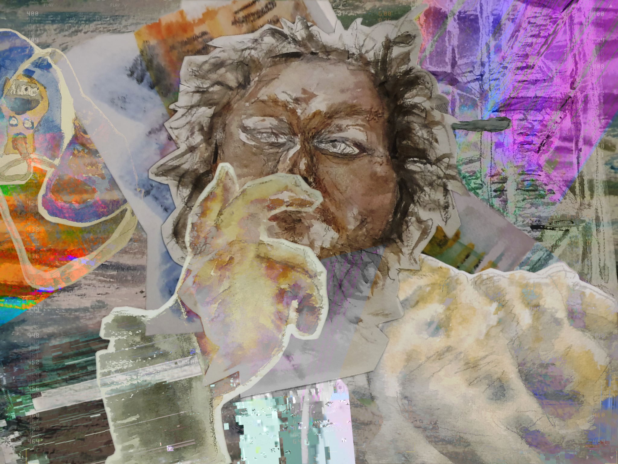
Self-portrait, Watercolor and Digital Collage (2022)
The goal was to pick things we found interesting or that mattered to our lives and integrate them in the self-portrait. Mine was created using watercolour, but then composed digitally from the small paintings. I also added digital textures, effects, etc – I am admittedly a fairly terminally online person, so these felt fitting. If you look closely you can see some musical tracker interface in there, and the glitch art at bottom left is quite prominent. It is one of the works I’m rather proud of – the effect is striking, and I feel that it really represents me, on a level more than mere physical resemblance. The facial features are accurate for it to be a recognizable representation, which was also important for me. Alongside these we also went through each others’ visual art histories, outlining what kind of art (if any) people had created before the course.
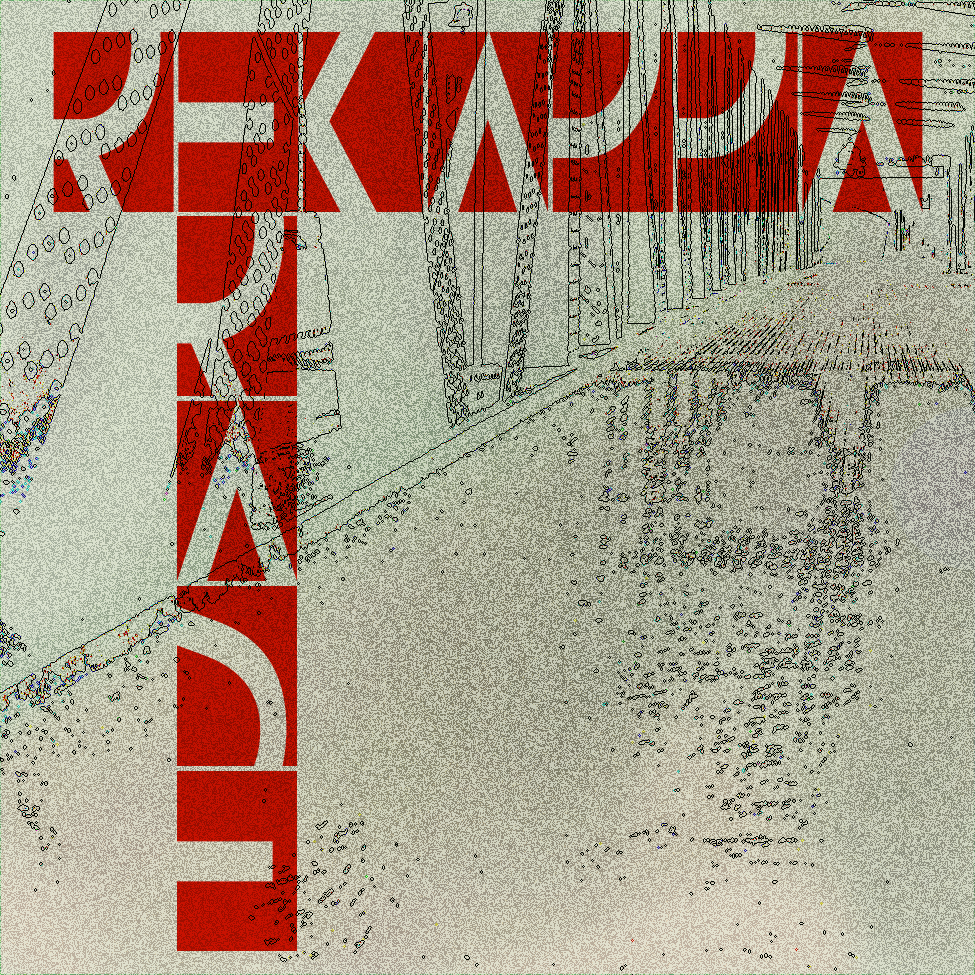
Excerpt from my Visual Art History: Album cover for Erase, by Rekapper (2014)
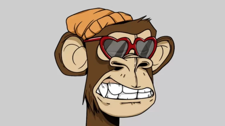
On another lecture we discussed art that we understood and, perhaps in a more spicy and interesting fashion, art we didn’t. This included everything from Edward Much’s The Scream to Leonardo da Vinci’s Mona Lisa. My submission was a random bored ape – representing the NFT art craze that was absolutely raging at the time, and making some people millions and millions in Ethereum and other cryptocurrencies.
This one was sold at Sotheby’s for $20 million. I still don’t understand.
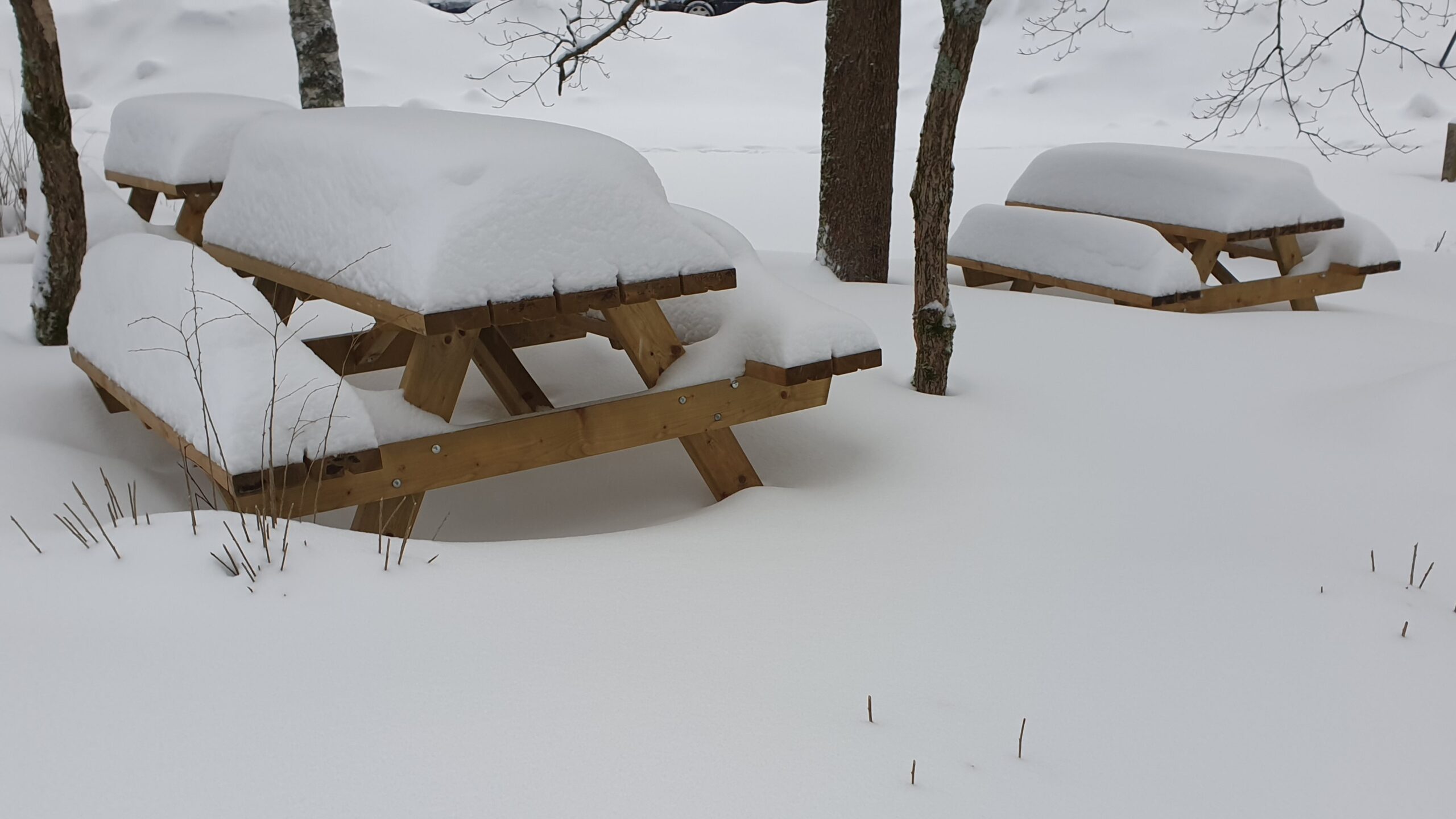
Other things done during the course included a photograph series based on some kind of common theme. Mine was about manmade things buried in snow – something about the nature temporarily partially reclaiming things we’ve built struck me as poetic, and this being January in Finland, I had plenty of material to shoot.
Only snow had been served on these tables for months.
The point of these practical exercise, I believe, was to get us out of our shells and into exploring all the different kinds of ways to create art we could be utilizing in the future. We covered quite a wide swatch of different techniques, from traditional drawing and painting, to photography, to different collages – one time we had to paint something in monochrome watercolour, cut it into pieces, and rearrange the pieces into another work. We also got to create short animations using FlipaClip on school-provided iPads, which was exciting and certainly new to me.
grwth (2022, animation)
Considering the time limitations we had, I am very happy with how this turned out. It’s only 11 seconds long, but that’s quite a few frames, and I managed to tell a bit of a story. Overall I think these short excursions to different artforms were quite helpful, even if I wouldn’t consider all of them successes. The time for technical prowess would come later into the degree – in the courses specifically for drawing, colour theory, painting, sculpting, and printmaking.