After finishing the courses for drawing and colour theory, it was time to combine them. Our teachers on this course were the artists Mari Antjärvi and Minja Revonkorpi.
This course was extremely fun! I could really feel things that we had been taught previously come together on paper and canvas. Acrylic painting was a relatively new medium for me – I had primarily painted in gouache and watercolour before, so that posed some challenges but I feel like I got much more comfortable as the course went on.
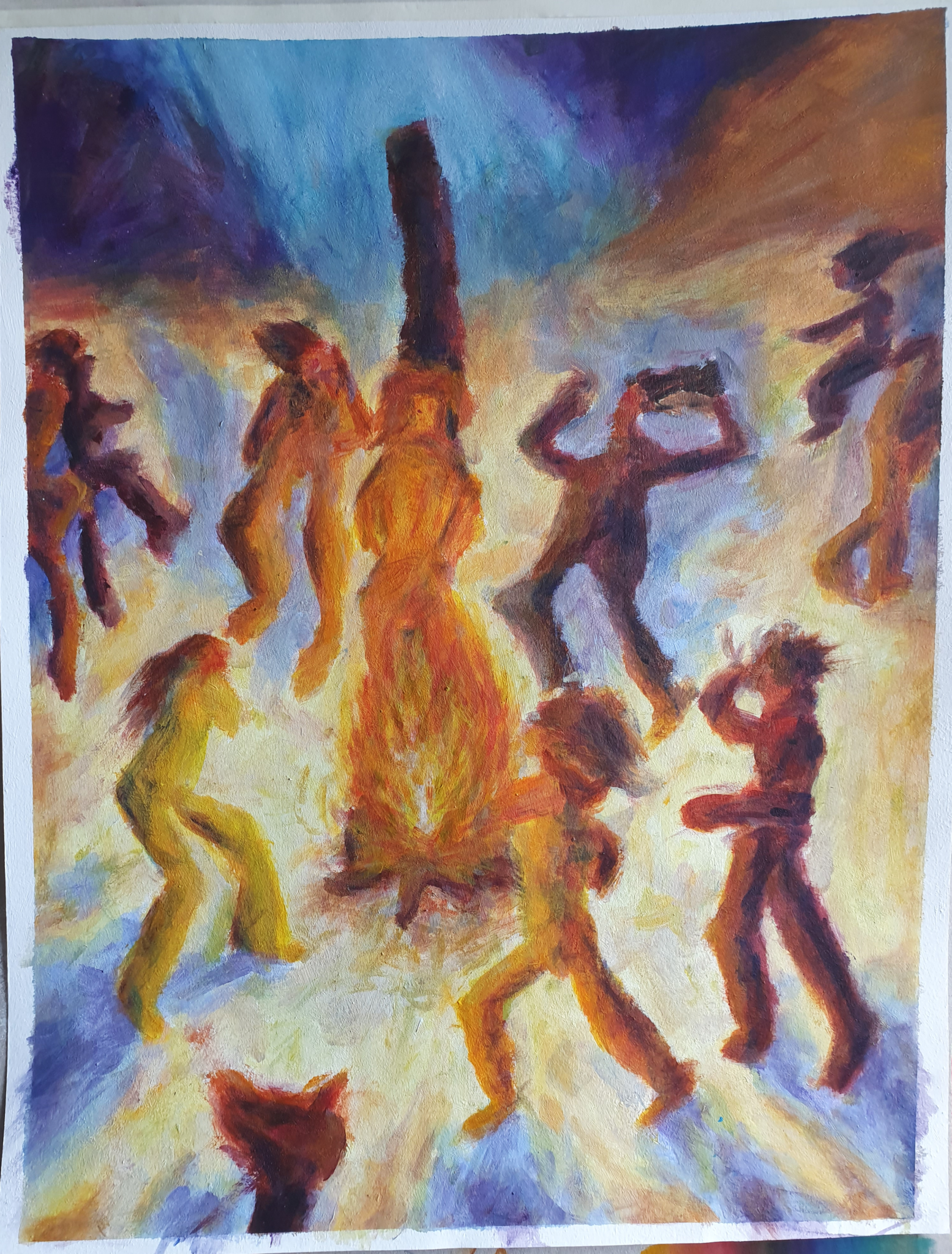
One of our tasks was to paint a pastiche, based on some historical artist. I chose Emil Nolde, a german expressionist painter, and more specifically his work of Dance around the Golden Calf (1910). I did an.. Acceptable job, I believe: The brushwork is not quite as thick and expressive, and for composition’s sake I should’ve included more overlap between the figures, but the colour and mood are rather successful.
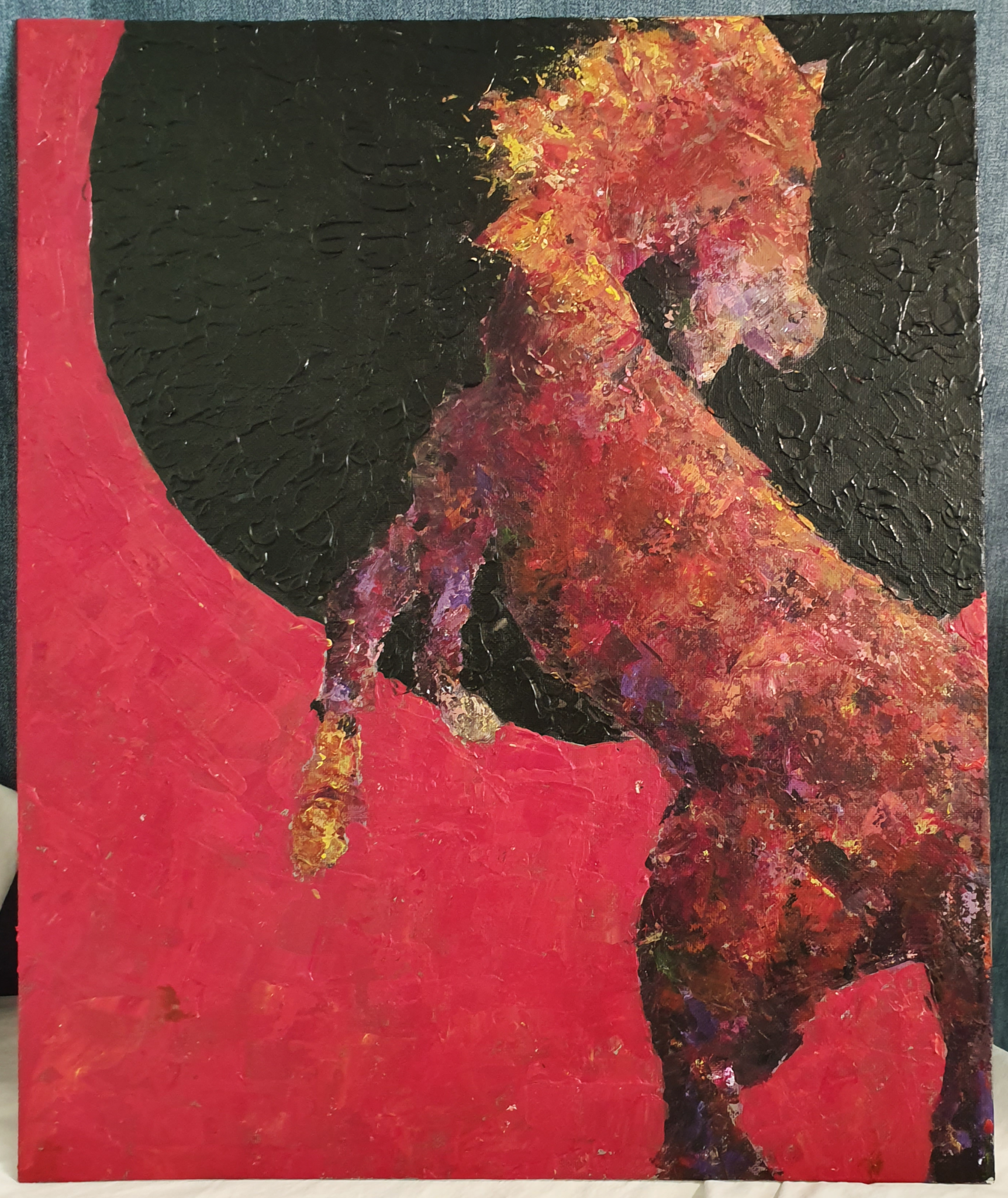
The inspiration for the work above came from horses left behind by European soldiers as they pulled back from Africa, specifically Namibia – the desert environment was not exactly a hospitable place for the horses, but one they could survive and thrive in without many dangerous predators. By now they’ve formed their own herds and arguably a breed of re-wilded horses in the area. I wanted to represent the scorching heat, the environment, but also the newfound freedom in this piece – and I felt like I really succeeded. I also noticed that I enjoy acrylic painting much more when I’m painting with a palette knife, rather than brushes.
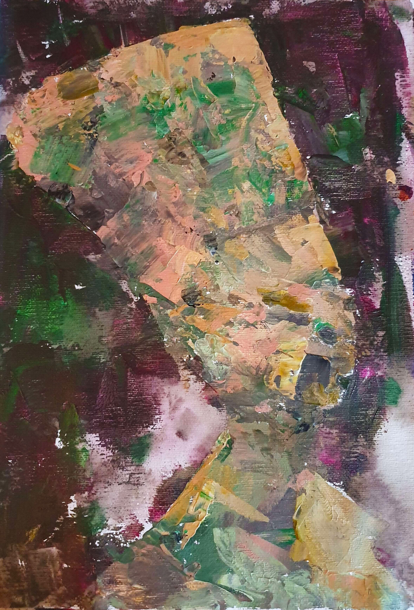
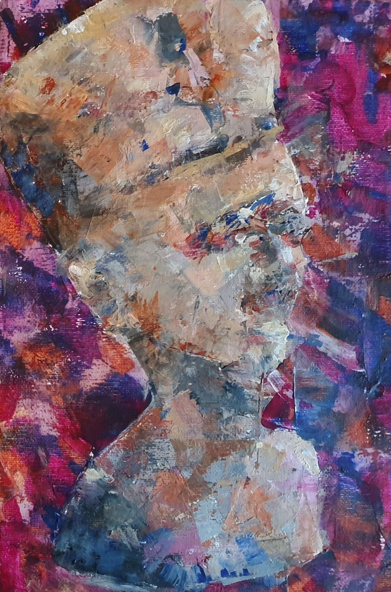
One of our exercises was picking limited colour palettes – one palette consisting exclusively of colours that we liked, and one from colours that we didn’t like, then paint the same subject with both. Time was limited, so I did quick semi-abstract paintings of the Bust of Nefertiti. To my surprise, the painting with the colours that I originally didn’t like turned out to be much better. Part of that is undoubtedly the fact that the silhouette is more accurate, and the background is less noisy, but I was still surprised. It was definitely eye-opening to see that originally unpleasant colours could end up in a harmonious whole.
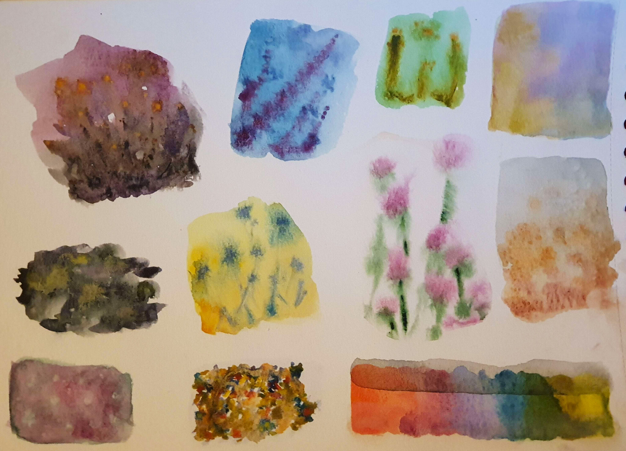
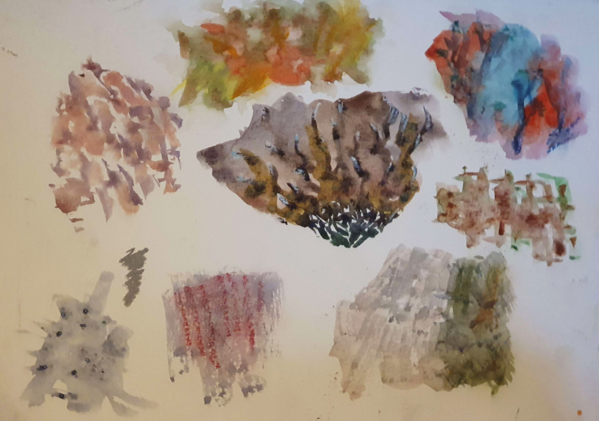
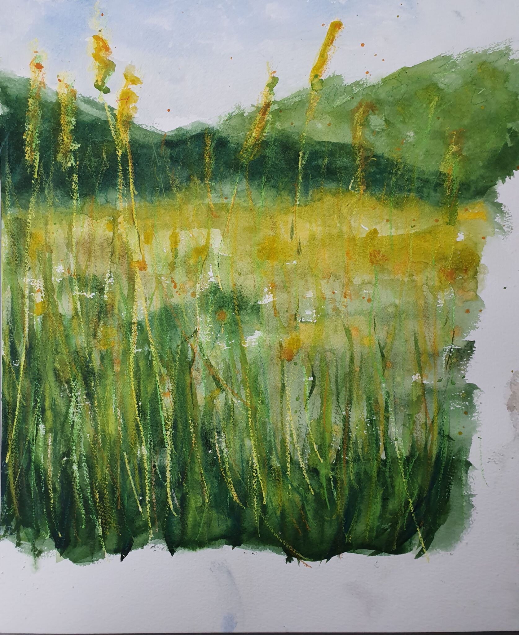
For watercolour we began with an exercise of painting different textures, using different techniques. Pictured above are wet-in-wet techniques with and without addition of oil pastel, the latter of which was put into practice in the vignette of a field, though utilizing wax pastels as a wax resist instead of oil pastels. We also tried methods such as adding salt crystals, cling film, aluminum foil, etc – too many to display here, and with various results in quality. Watercolours are a really versatile medium with a great range of expression. They lend themselves great not only to more abstract work, but representative pieces as well.
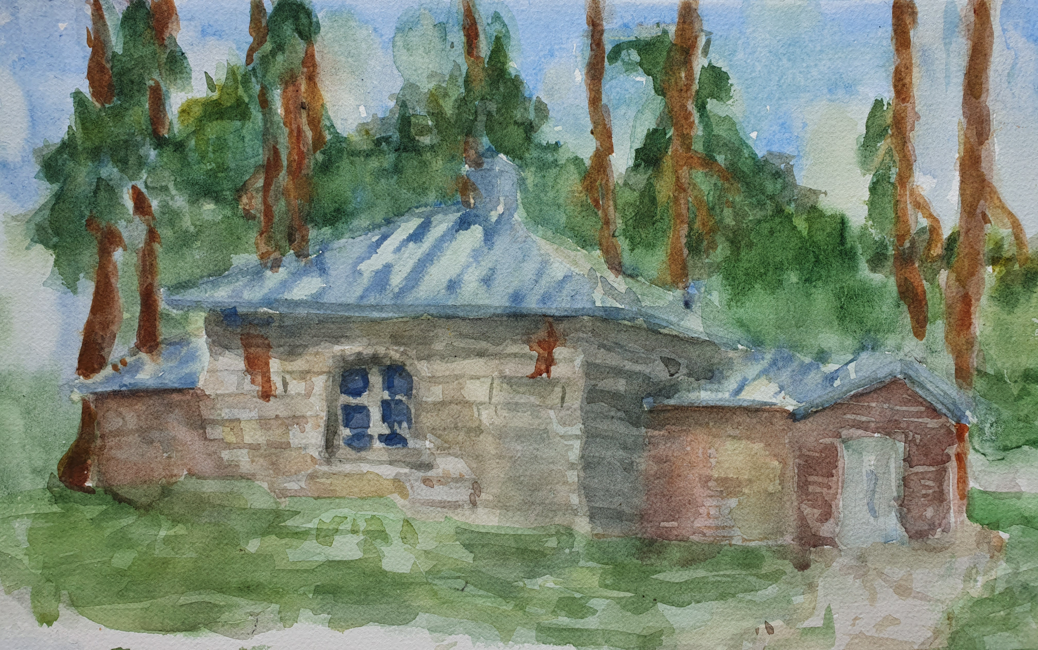
The more representative example above was painted en plein air, which gives it a rather sketchy and immediate feeling. It is of a previous smith’s workshop which has been remodeled as a meditation / calming room, at the middle of the campus of University of Jyväskylä. The light changed numerous times even in the short period I had to paint it, which proved to be really challenging.
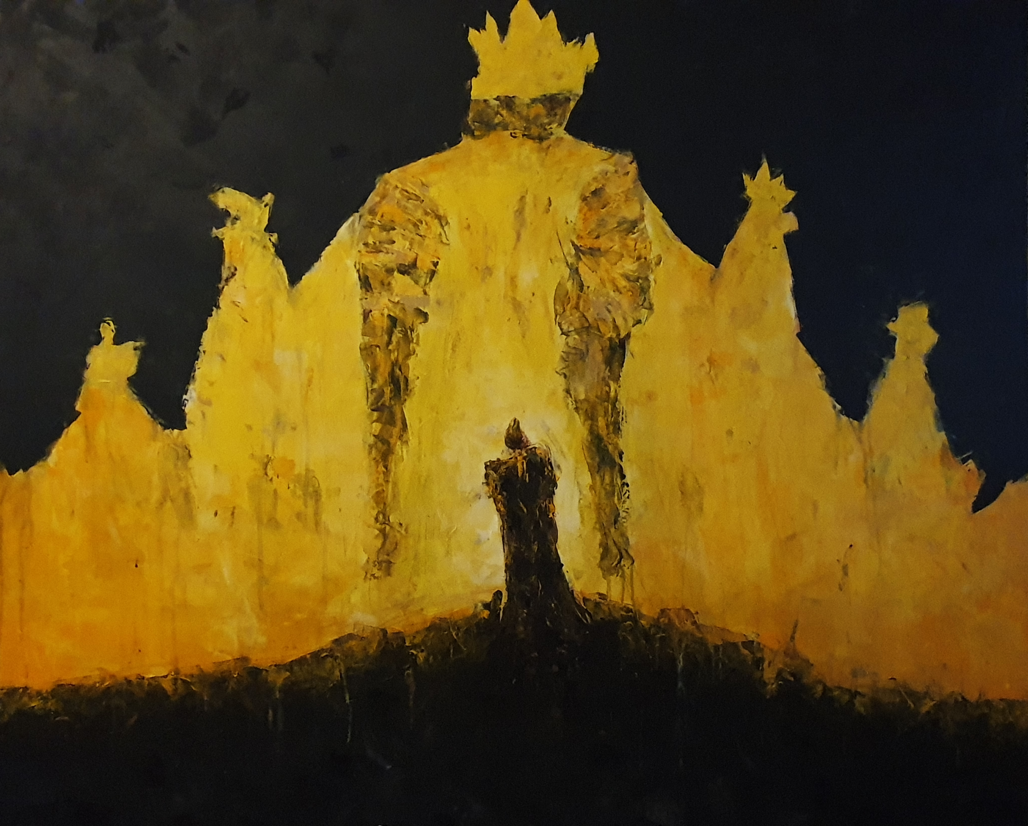
Our final project of the class was to paint something large – my painting was 120 by 100 centimeters, and felt like an absolutely gigantic endeavour at first. The title and inspiration has been taken from an early example of weird / horror fiction, a short story compilation by the same name written by Robert W. Chambers, published din 1895. It deals with the themes of grandiose, but perhaps unwanted and undesirable destiny. After I had gotten to it, it was a joy to paint – there’s something physically pleasurable about working on a larger surface, where you can use more of your body to create expressive marks. I am glad about how it turned out, and the limited colour palette of only yellows, browns, and blacks works really well to accentuate the mystical but grandiose feeling I was going for.
As I said at the beginning of this post, this course was extremely fun! Painting is a preferred form of visual expression for many, and I can definitely see why. I’ve taken things I’ve learned from this course and already applied them to my art outside of the degree, and that’s a great sign of a successful course.